• Work
  • Film
  • About
  • Contact
  • Blog
  • Shop
Josh Holtsclaw
  • Work
  • Film
  • About
  • Contact
  • Blog
  • Shop

The Graphic Art of Incredibles 2

I2_banner.jpg

I remember seeing the first Incredibles film in college with a few friends. We went on opening night and the theater was packed. I remember thinking that the way the movie opened with the old film footage of a younger Mr Incredible, Elastigirl and Frozone being interviewed was such a different way to open an animated film, and it just got better from there. The whole thing was so stylized and just…cool. I loved the mid century aesthetic. When I got to Pixar and heard that they were working on a sequel, I knew I wanted to be a part of it.

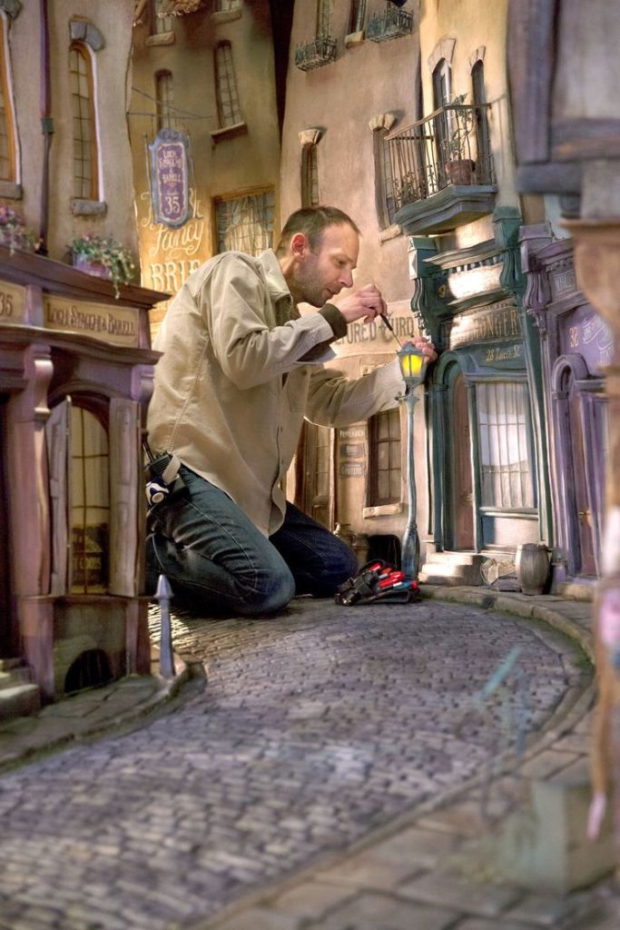
I joined the Incredibles 2 art department in the Fall of 2016 and one of the first things we did as a group was take a research trip to Palm Springs. At the time, the story was still in its early stages and a few of the sets were under way.  There was still a lot left to do and Palm Springs was the perfect one-stop-spot for us to find design inspiration.

front-2_1200_02.jpg

PALM SPRINGS RESEARCH TRIP

We were able to take an architectural tour of the city and had access to private homes that aren’t usually open to the public.

One of the most memorable houses was the Frey house which was designed by architect Albert Frey and was also his personal residence. It sits on a hill looking down on Palm Springs.

Frey-House-ii-by-Albert-Frey-Yellowtrace-21.jpg

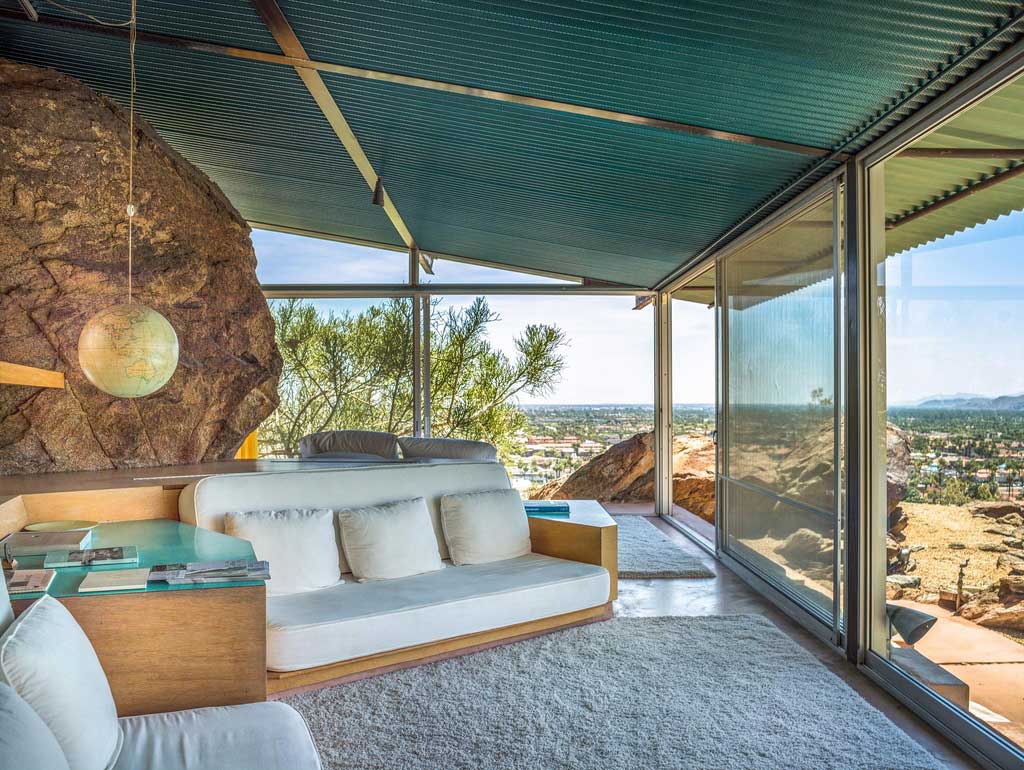
It happens to have a giant boulder that is half inside and half outside of the house, which is an element that ended up in the new house that was designed for the Parr family. 

cburrowsPalmSprings-815.jpg

Here is an outside view of the house. Pictured here is character designer Deanna Marsigliese.

IMG_9891 (1).jpg

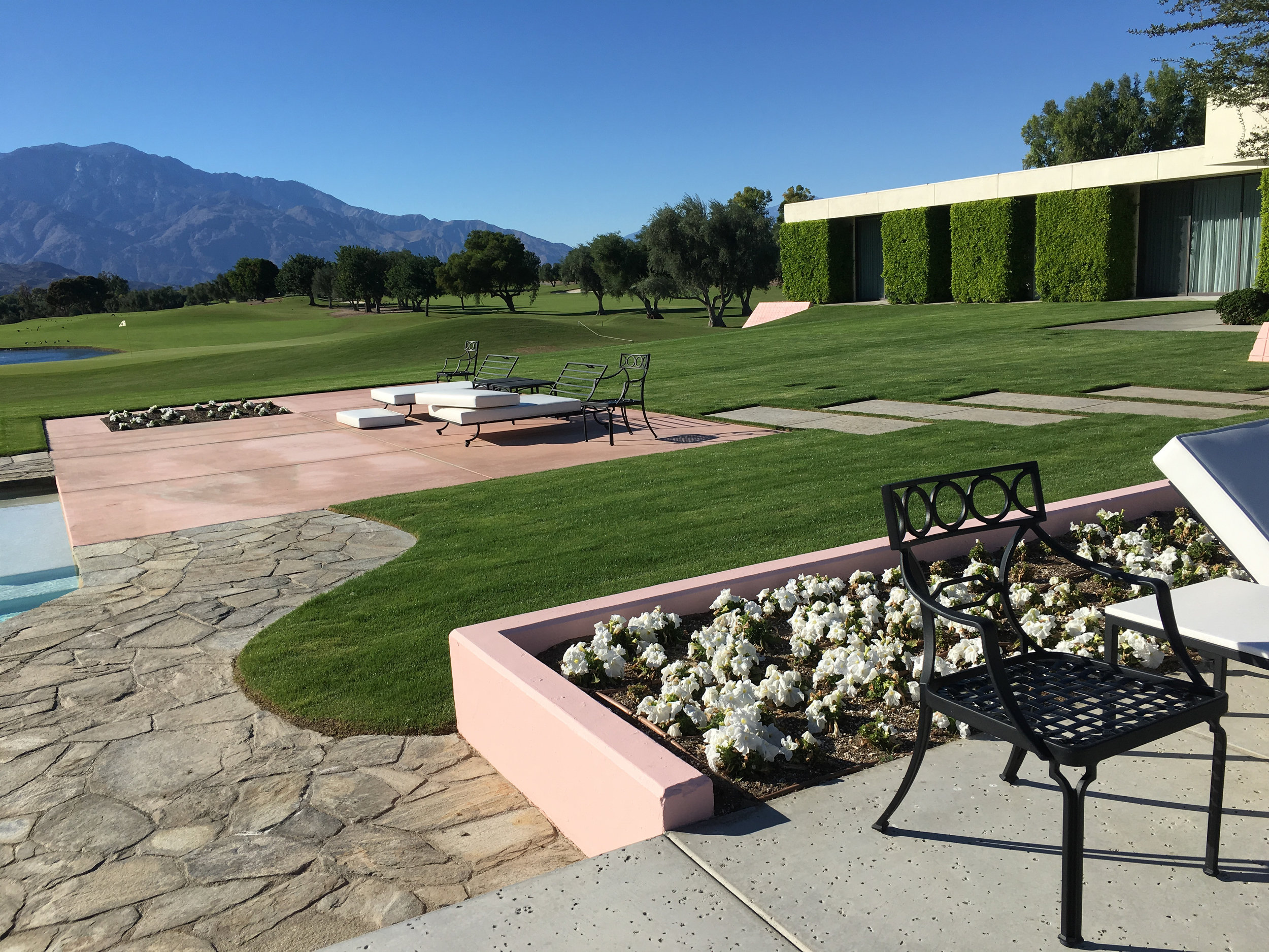
Another place we toured was Sunnylands, which is a sprawling estate with multiple buildings and its own golf course. It was owned by Walter & Lenore Annenberg. Walter was the founder of TV Guide and Seventeen magazine. It has also been a favorite retreat for Presidents through the years.

05-sunnylands-16.jpg

Sunnylands was so much bigger than the Frey house and it was great to see an example of mid century modern architecture at a larger scale.

cburrowsPalmSprings-828.jpg

We also visited private residences that had amazing special features. This house in particular had a pool that butted up against the living room and a bar that you could swim up to.

2016-11-01 17.20.08.jpg

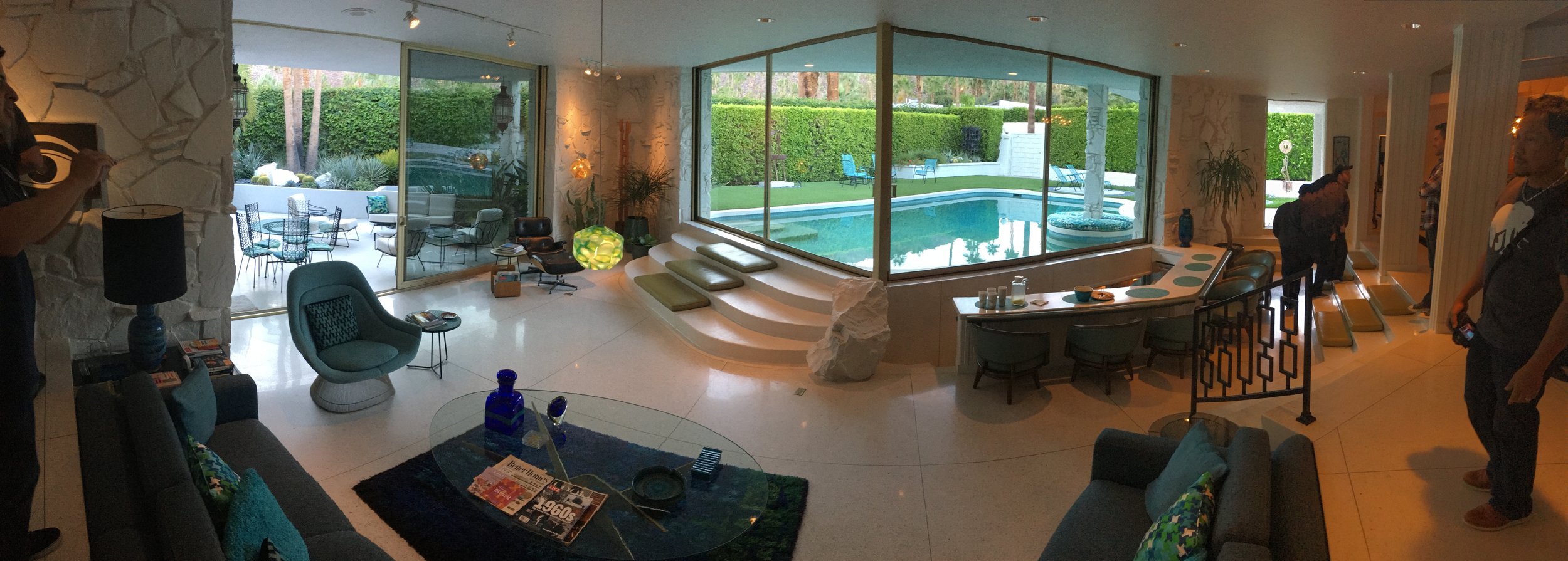
Here are some finished shots of the new Parr house. You can see how we were inspired by the hillside placement and indoor/outdoor feel of the Frey house:

z102_117acs.sel16.215 copy copy.jpg

Combined with the huge scale of Sunnylands:

z102_102cs.sel16.278.jpg

And some of the cool special features found in some of the other homes we visited on our trip.

z102_112ccs.sel16.731.jpg

Pictured here is Nathan Fariss- Sets Supervisor, Tim Evatt- Set Designer, Robert Imbur- tour guide, Kat Hendrickson- Art Coordinator, Philip Metschan- Previs Lead, Isabel Conde- Art Manager, Kyle Mcnaughton- Set Designer, Devon Stubblefield- Art Intern and the home owner.

cburrowsPalmSprings-97.jpg

One of the best things about visiting these homes was seeing the interior details that felt like perfectly preserved mid century time capsules. There was so much inspiration to be found in the furniture that the homeowners chose and the artwork they displayed.

IMG_9303 (1).jpg

I loved this house because they displayed a few original Disneyland attraction posters, which we were already using as inspiration for the movie. Seeing them in context like this showed how perfectly this art style fits into this kind of environment.

cburrowsPalmSprings-796.jpg

In touring the homes we were also able to get up close to and photograph so many small details. A few of the homes had original appliances that we were able to photograph, like the oven on the left and the wall clock in the center. All of the colors and materials we saw were helpful in the shading work in the film.

Screen Shot 2018-11-06 at 8.41.08 AM.png

INSPIRATION & REFERENCE

The world of the Incredibles is very specific in its design, but also a little hard to define. Ralph Eggleston, the production designer always summed up the look of the Incredibles by saying “you know it when you see it.”

To get into developing artwork for the film, I did a deep dive into the first Incredibles. One thing I noticed is that while it is definitely mid century modern inspired, not every piece of mid century design would fit into the world of the Incredibles. I tried to get more specific about defining the look of the graphic art in the film.

Some of the most inspiring and useful sources of inspiration were the 1962 World’s Fair in Seattle and the 1964 World’s Fair in New York. The World’s Fairs were examples of futurist thinking from a mid century perspective. They took place in the 60’s, but were about a distant space age future which was perfectly in line with Brad’s vision for the world of the Incredibles. 

02.png

The shapes and lettering styles seen here are simple and bold. There isn’t a lot of tiny detail. Its direct and clean and modern in an understated way.

03.png

There were so many great artists and designers working in the mid century that were inspirational to our film. One of the most helpful sources of inspiration was the designer Alvin Lustig, who created all of those great book covers on the left. You can see in his work and these other examples the use of bold, graphic and modern design.

04.png

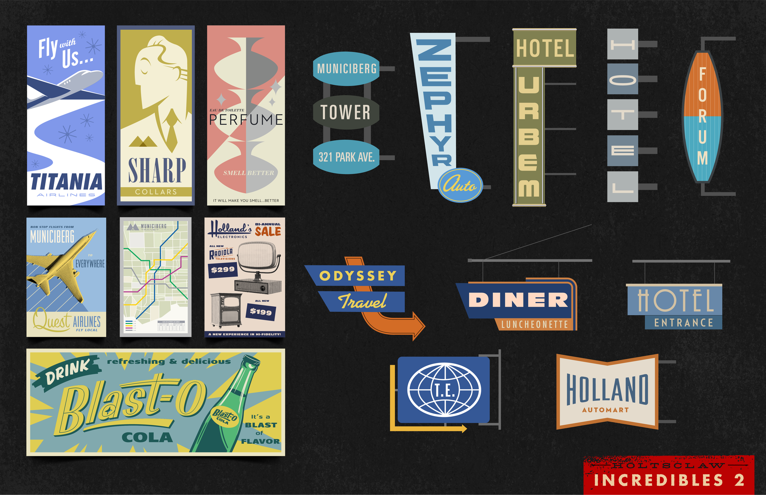
In the movie there are two cities. Municiberg, where the Parrs live and New Urbem where Helen travels to fight crime.

 For downtown Municiberg, we looked at photographs of medium to small sized towns from the late 1950’s.  

06.png

For the design of New Urbem, we looked at Times Square from the late 50’s. Ralph’s concept for New Urbem was that it was bigger than Municiberg, and had a much heavier, older feel.

08.png

I was also inspired by the work of Miroslav Sasek. It was great to see how he simplified a complex city scene. It looks stylized and the same time believable.  

Screen Shot 2018-11-08 at 8.11.45 AM.png

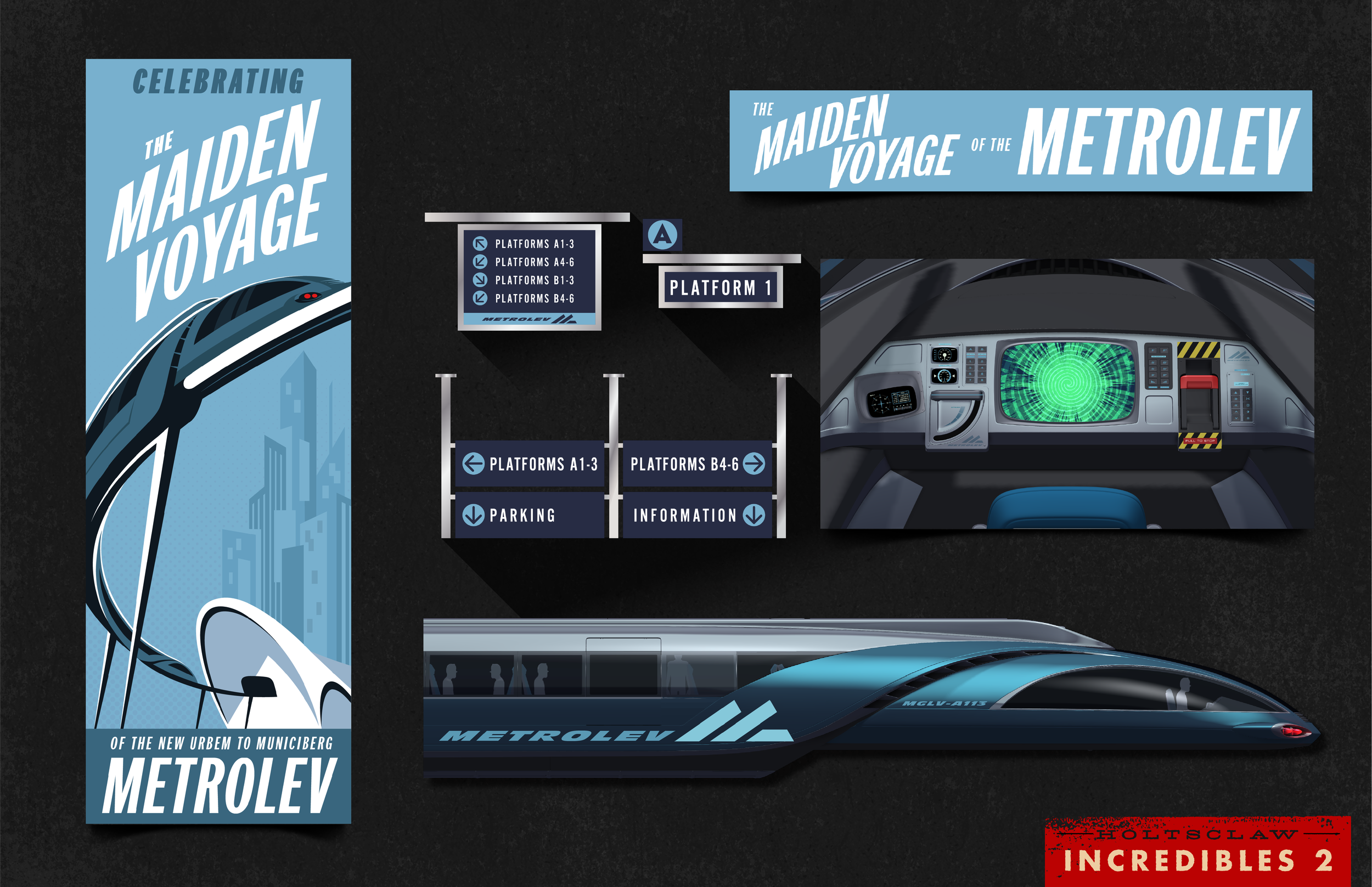
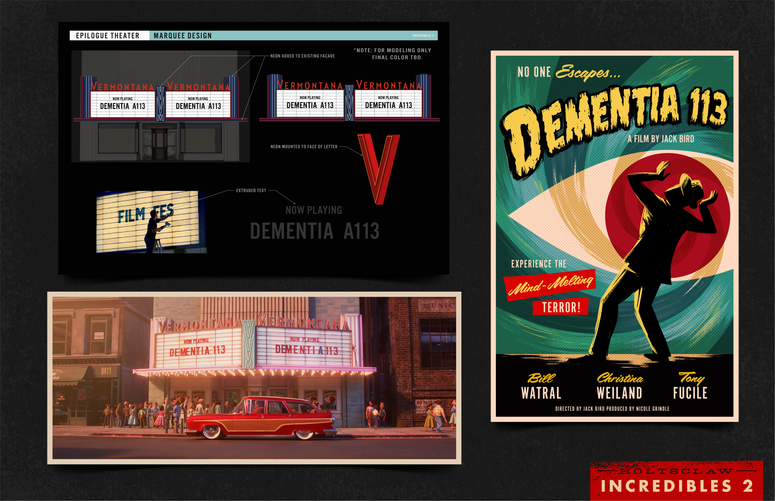
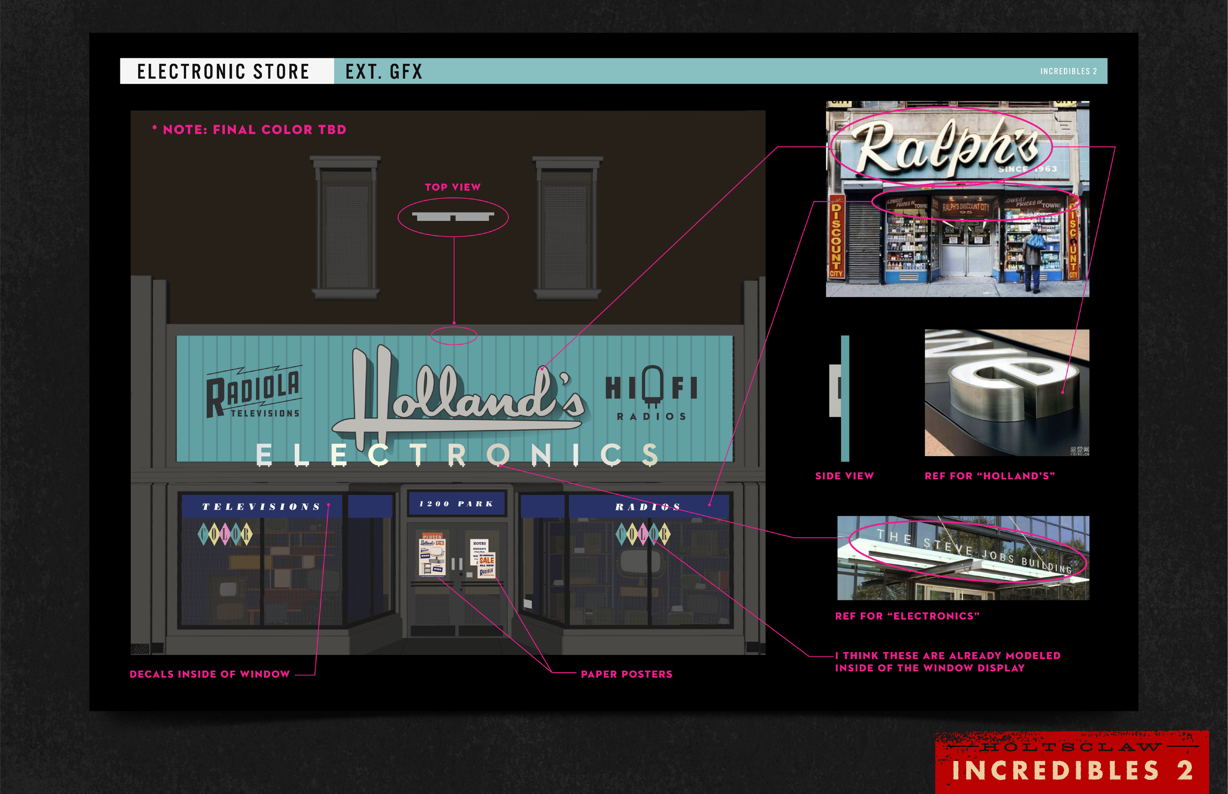
Here is a collection of some the graphics we developed to use in New Urbem and Municiberg. Everything from Shop signs and billboards to posters and murals.

*Incredibles2_Portfolio-14.png

For the Tracking Screenslaver sequence, Helen is jumping around the rooftops of New Urbem. To add a bit of interest, we added rooftop billboards which were inspired by the signage seen in Times Square. This also helped identify which city we were in for the New Urbem sequences, since the movie jumps back and forth between the two cities. The graphics help to tell the story and add dimension and detail to the shot.

*Incredibles2_Portfolio-03.png

 For the pan up reveal of Helen on the radio tower, we added all of the rooftop signage we had in our inventory. In the middle of the shot you can see “Quest Airlines,” an homage to Jonny Quest, a major influence on Brad and the world of the Incredibles.

z511_2d_cs.sel16.265.jpg

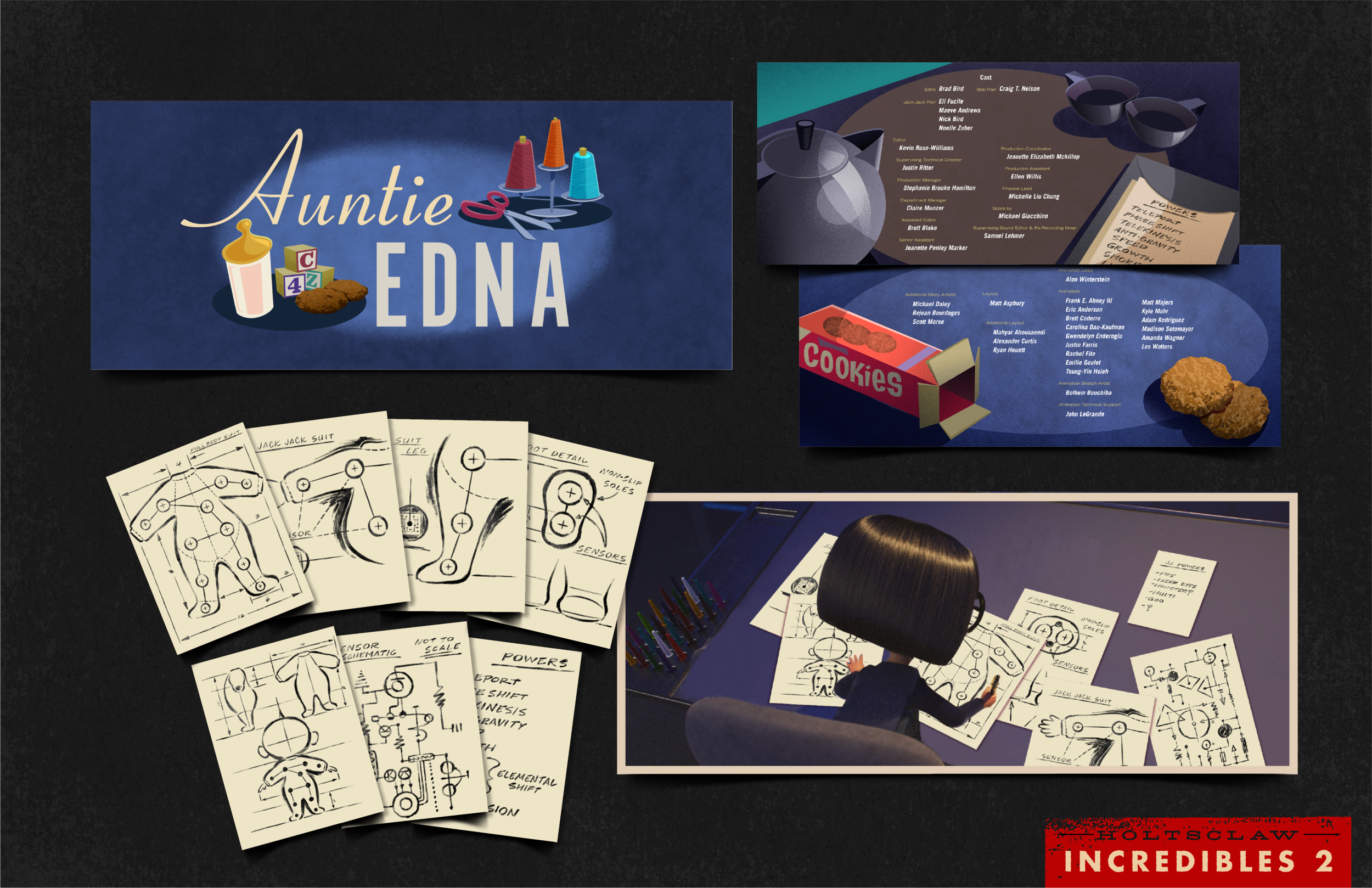
Incredibles 2 was filled with screens, and designing and animating the motion graphics was another significant aspect of the work the graphics team. As you can see here, most of the motion graphics are communicating some story point to the audience. Not only are we trying to literally tell the story in the design, we also tried to make them cohesive aesthetically so they all look like they belong in the same world. We also try to add humor where possible. In the shot where Violet and Dash give their names to the Incredibile for the first time, we pitched Brad the idea that it would be funny if it took a picture of them when they said their names, and the photos were sort of panicked headshots. He loved the idea, and the characters, animation and lighting teams all jumped in and helped make the photos possible. Its a quick shot but it gets a little laugh every time.

Screen Shot 2018-11-08 at 8.19.44 AM.png

In a lot of modern movies, the motion graphics are really complex and detailed. For the motion graphics in Incredibles 2, we looked at the Futurama exhibit at the 64 World’s Fair, the screen designs in Alien and Rogue One. All of these have a simplicity to them that is perfect aesthetically for the world of the Incredibles.

22.png
*Incredibles2_Portfolio-15.png

We created an entire branding pass for the fictitious company Devtech. Devtech is a tech company that specializes in lenses and cameras, and Brad liked the idea of using an eye as the icon. The star burst is a motif that can be seen around the Devtech headquarters, so we combined that element with the eye to land on the final design. This branding is used across the film and helps to visually connect the Deavor storyline.

*Incredibles2_Portfolio-04.png

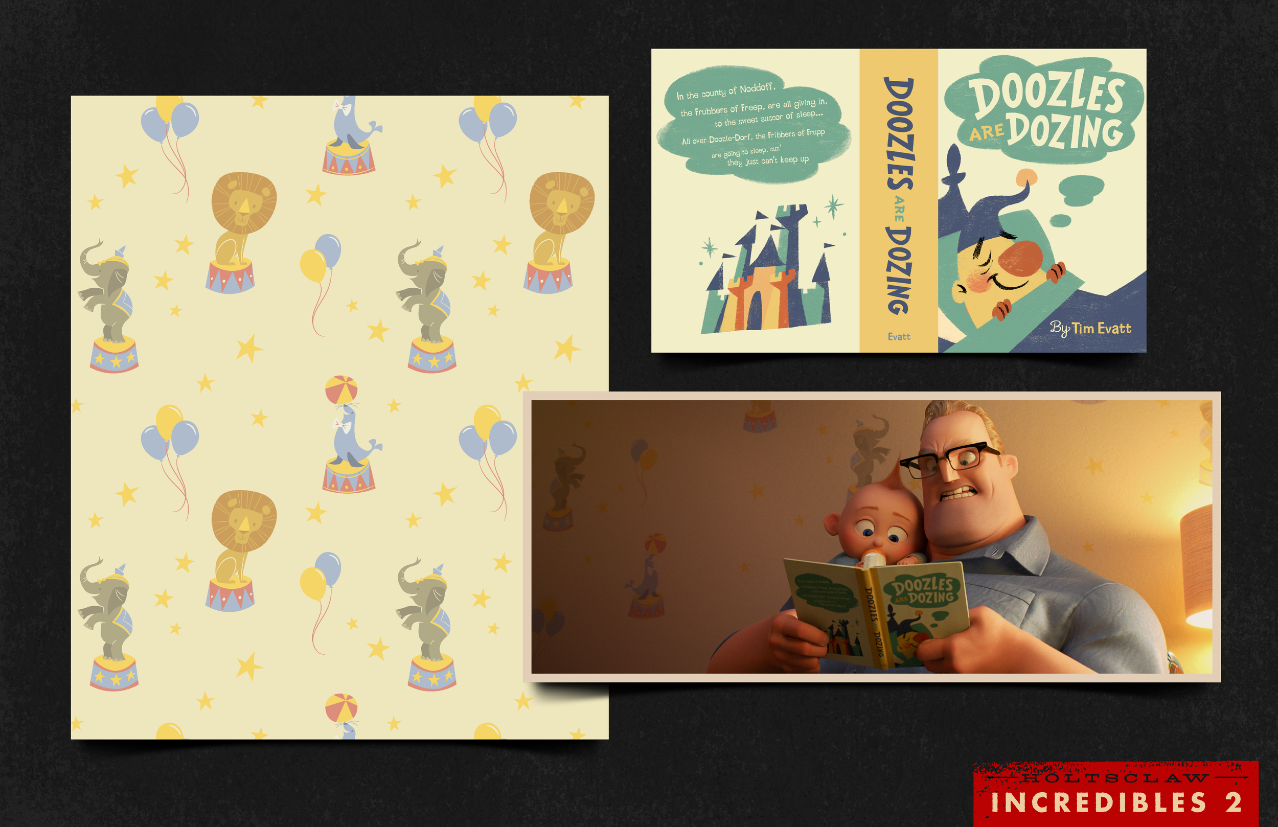
Here is an assortment of prop graphics that were created by fellow graphic artist Paul Conrad and I for the Parr kitchen. The challenge is to create something that looks and feels right when it is sitting next to the characters. Ideally, the same design thinking that goes into the character design goes into the set and prop design as well, making the world feel cohesive.

*GFX_for_Publishing.2-14.png

One of the hardest things to do was this cereal box where a character illustration appears next to one of our real characters. I turned to Teddy Newton for help on this illustration, and the stylization feels perfect next to Dash. We also play up the humor of it being an over the top sugary cereal so that when it gets swapped out for Fiber O’s, we understand where Dash is coming from.

*Incredibles2_Portfolio-08.png

We created the Happy Platter and Safari Court branding to tell the story of the two environments. When the audience sees these places, they recognize something they might have seen before. These memories help them connect to the mood we are trying to create. 

*Incredibles2_Portfolio-05.png
*Incredibles2_Portfolio-06.png

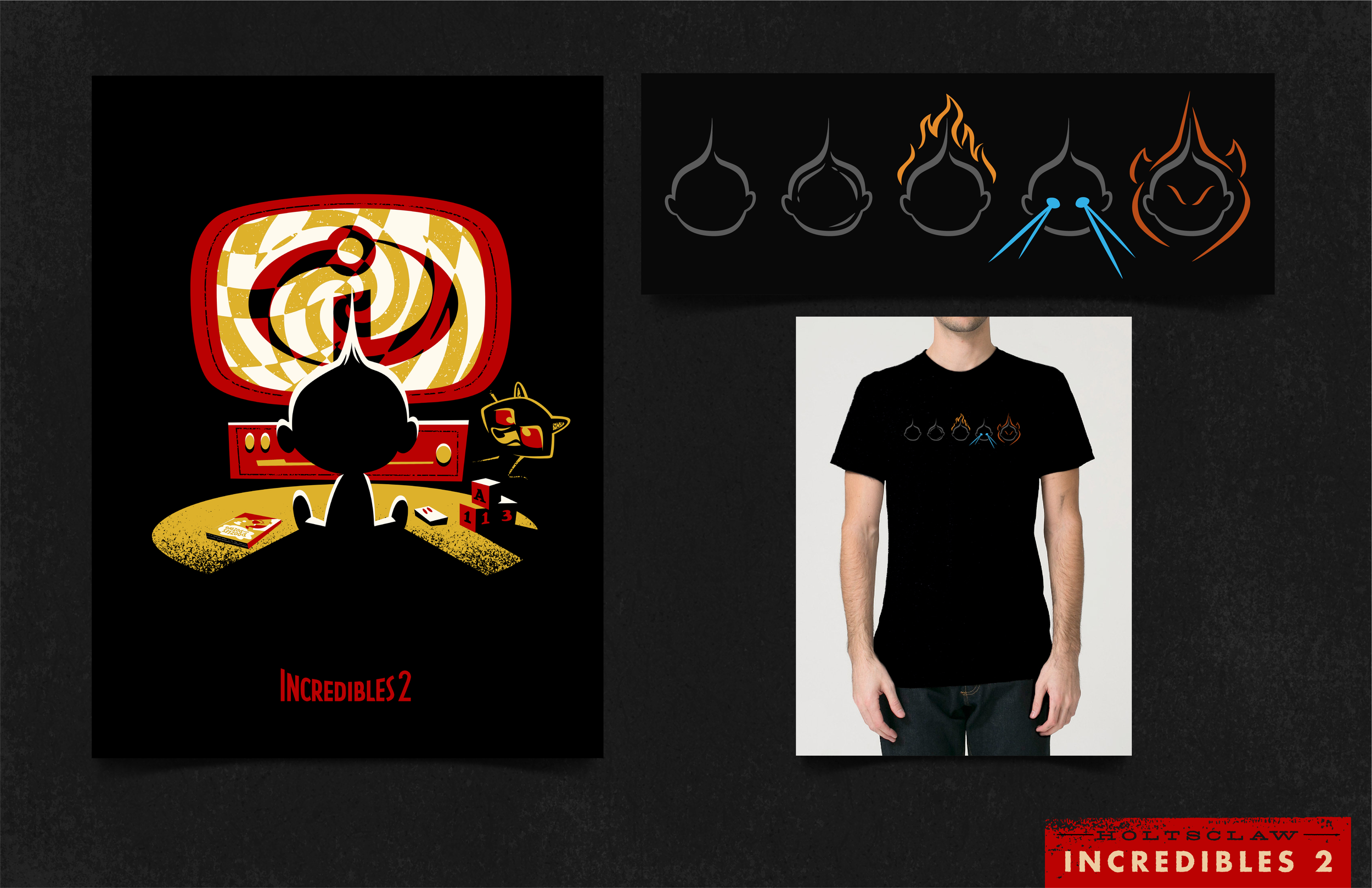
SCREENSLAVER MOTION GRAPHIC

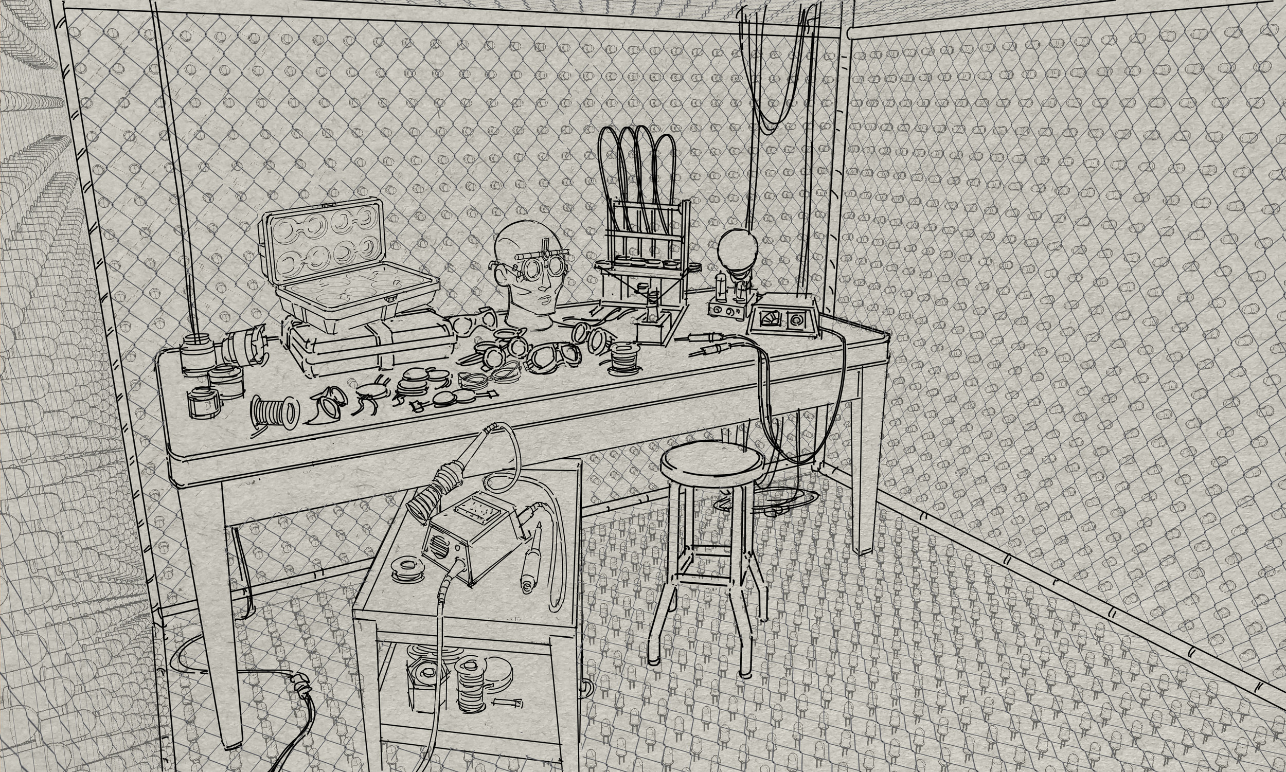
One of the things I worked on for the longest time while I was on the film was the Screenslaver motion graphic that the character uses to hypnotize viewers. One of the challenges was that it would appear in many different places…tv’s, goggles, a cage, just to name a few. 

Ralph and I looked at the work of experimental animator Oskar Fischinger and were really inspired by the graphic shapes and repeated patterns he used. 

Here’s another, later Fishinger piece with more color. 

This is a sketch that Brad did on the back of a script in a meeting showing what he was envisioning for the Screenslaver hypnosis design. It was extremely helpful to see exactly what he was looking for.

Screen Shot 2018-06-18 at 9.25.22 AM.png

From that sketch, I put together a batch of animation loops that all play around with distortion and spiral effects. I was also playing around with the idea of a spiral disrupting another pattern. Where the spiral disrupts the lines, shapes are inverted creating a swirling checkerboard effect.

The final design is below on the bottom right.

*Incredibles2_Portfolio-17.png

The script called for a sequence in which a fight took place in a cage made out of lights that would hypnotize Elastigirl. Ralph found this product called an LED Curtain that can project video through a web of tiny LED lights. This was the inspiration for Screenslaver’s cage.

From that inspiration, set designer Paul Abadilla designed the interior of the cage, lining the walls with light bulbs. We then projected our Screenslaver motion graphic through the bulbs to create an effect that looks like it could hypnotize Helen. 

SSLairINT_MP_Beats_PA_06.30.17_004.jpg

Here’s what the final image looks like in the movie. 

z508_276_cs.sel16.658.jpg

DEAVOR MEETS SUPERS

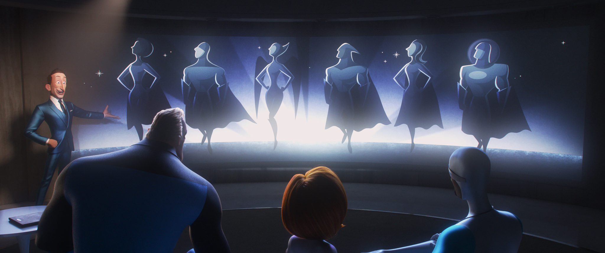
There is a sequence in the movie we called Deavor Meets Supers, where Winston is laying out his plan to the supers. This was a fun small project because it was almost like its own little short film within the movie. 

DMS_PRINT.rgb.jpg

Starting with the storyboards, I created this collection of images and paired them with the lines of dialogue Deavor says. This is how I pitched it to Brad. The concept was that you would see each super in their glory days, and that pose would then be singled out and brought forward, before transitioning to the lineup of generic supers. And aesthetically all of this was meant to look like it was part of the Devtech brand, like it was a film that the company had created. 

Here’s how it looks in the final film.

z101_152f_cs.sel16.268.jpg
z101_152f_cs.sel16.346.jpg

END CREDITS SEQUENCE

One of the last things I worked on for this project was the End Credits sequence. The original film had an amazing graphic stylized end credit sequence designed by Teddy Newton and Andy Jimenez. For Incredibles 2, Brad wanted to do something that felt similar stylistically.

incredibles_contact-0-1080-0-0.jpg

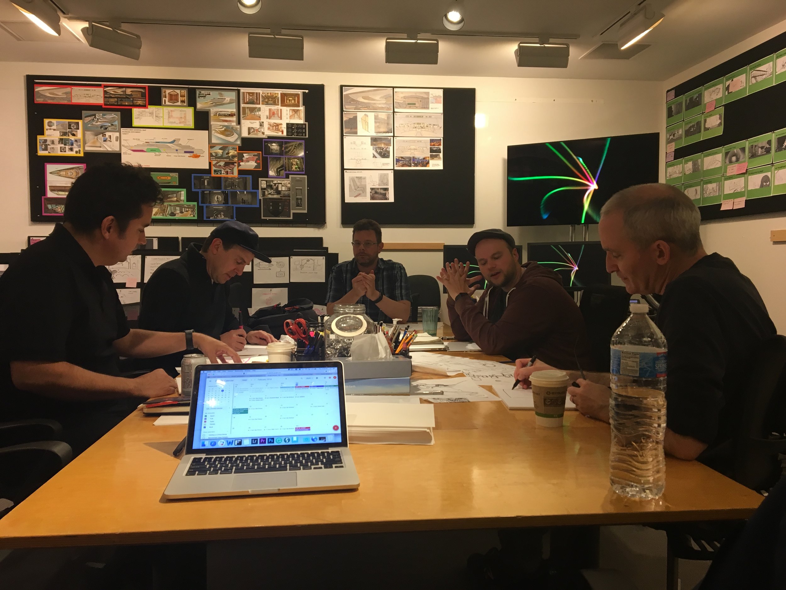
A team was assembled. Shown here is Andy Jimenez - Animation Lead, Teddy, Ted Mathot - Head of Story, and Derek Thompson - Story Artist. We sat in this room for a few days and drew and talked about a bunch of ideas for the end credits.

IMG_2792.JPG

After a day or two we had a few boards filled with story sketches and layout ideas. 

2018-02-06_17-17-08_989.jpeg

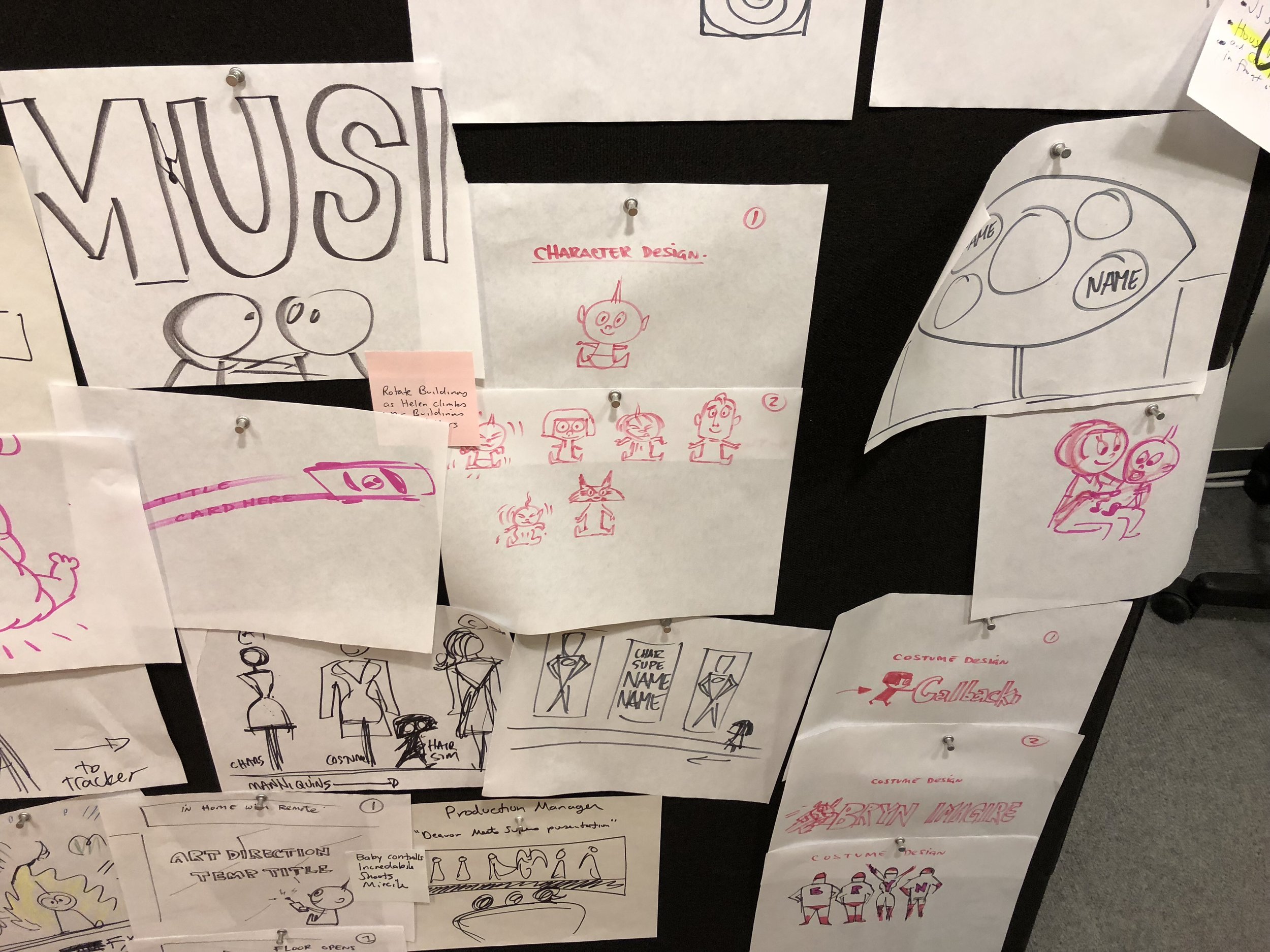
Here you can see a few discarded ideas, but also one that stuck, The idea of Jack Jack popping through a bunch of different heads stayed in the final sequence.

2018-02-06_17-17-02_098.jpeg

And here’s one of Teddy’s masterpieces that unfortunately didn’t make in.

Screen Shot 2018-11-08 at 12.23.44 PM.png

After some refining, we filled up the art room with more nailed down storyboards of how each title card would flow into the other. Laura Meyer and Paul Abadilla also joined in to help us get through all of the artwork we would need to create. 

2018.02.19_i2EndCredits_StoryBoards_007.JPG

And this is a detailed shot of our rough storyboards. Each column represents a card, and the images below are the transitional pieces of art that we needed to connect them.

2018-02-16_08-31-19_082.jpeg

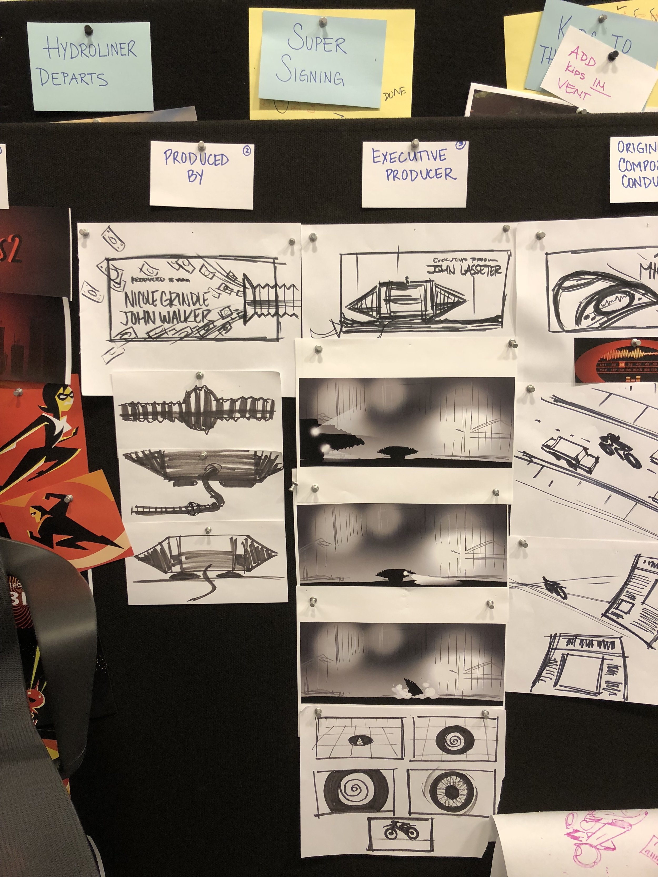
Here are some more of the storyboards. You can also see the little post it notes with assignments. Teddy helped with all of the character animation, we would paint the backgrounds, and then all of that would be compiled by Andy in After Effects.

2018.02.19_i2EndCredits_StoryBoards_013.JPG

Here are a few of the background paintings as we delivered them.

*ALL 2.jpg

We would check in with Brad each week as moved through the artwork and Teddy and Andy completed the animation.

brad-bird-incredibles.jpg

Here are few frames of the finished end credits.

*Incredibles2_Portfolio-16.png

DISNEY CASTLE INTRO

In our end credits kick off meeting, Brad said “Hey, it would be cool if we could do the Disney castle at the beginning in the same style!” And he looked at me with a face that said “you up for it?” I thought it was an amazing idea. I didn’t quite know what it would look like, but I knew that it should probably be red and yellow. There’s a tradition of stylizing the Disney castle at the beginning of a disney film, and I wanted ours to be the coolest.

I looked over the standard disney castle intro and broke it down into a few key frames that I could paint and show to Brad and Ralph. So this is the first frame with the camera holding on a star.

1.jpg

The camera pans down and catches a train passing over a river

2.jpg

And flies over and settles in front of the castle. While looking at the original castle, I noticed the Incredibles logo was already hidden in the windows above the entrance, and thought it would be a great way to fade out.

3.jpg
4.jpg

After showing those initial style frames to Brad, he thought the castle could maybe be less “castle-y”. So it had to be some sort of mid century castle that wasn’t a castle, but was clear to the audience that they were looking at the Disney intro. I looked at reference of mid century modern structures like churches and other large public buildings. 

castle_review-09.png

From that research I created castle concepts that drifted further away from the disney castle, but kept the same silhouette. Finally we settled on a design that I think could be called a mid century modern castle.

z095_803_cs.sel16.605 copy copy.jpg

After seeing everything together and in film order, we all thought that the Pixar logo would feel out of place if it stayed its iconic blue color. So we dug into the original files and created a stylized Pixar logo card complete with a black and yellow Luxo. The first in what I hope becomes a long tradition of stylizing the Pixar logo. 

z095_804_cs.sel16.258.jpg

All in all I worked on Incredibles 2 for around 2 years, which is the longest I have ever worked on a film. It was the most creatively challenging and satisfying film I have had the opportunity to be a part of. We had an amazing team and I learned so much. Seeing the positive reaction from the public after all of the hard work was the perfect end to a once in a lifetime project.

20170622Incredibles2ArtReview03-1024x683.jpg
*Incredibles2_Portfolio-07.png *Incredibles2_Portfolio-13.png *Incredibles2_Portfolio-09.png *Incredibles2_Portfolio-12.png *Incredibles2_Portfolio-10.png *Incredibles2_Portfolio-18.png
Thursday 11.08.18
Posted by Josh Holtsclaw
 

The Graphic Art of Cars 3

C3_banner.jpg

In September of 2015 I accepted a position at Pixar as a Graphic Artist, so Monica and I relocated to the Bay Area. At the time I didn't know what project I would be working on, but when I arrived at the studio I was excited to join the team working on Cars 3.

I was a fan of the Cars movies and a huge fan of Cars Land in Disneyland. It would be the first sequel I had ever worked on, and I was excited by the unique challenges that sequels offer. Also after coming off of Kubo, I was excited by the idea of working on such a different movie. It just seemed like fun. Especially fun for a graphic artist, as the Cars world is filled with graphic art. The Cars 3 art department was filled with talented artists, art directors and production designers. It all promised to be a great experience.

Racers

FullSizeRender.jpg
*Holtsclaw_Cars3_Portfolio-12.png

One of the first assignments I got on the new film was working on all of the cars that would be racing Lightning Mcqueen. Early in the film there is a race montage where we visit many race tracks back to back, and each race is filled with around 20 racers. With any new assignment I begin with research, which, for this project consisted of digging into the racers that existed within the Cars universe. Up to this point the franchise consisted of two feature films, multiple shorts, and a huge amount of toys that were all beloved by fans. Digging through the artwork from the first film was a great way to get a crash course in the Cars world. Craig Foster designed all of the racers in the original film, and having him as the graphic art director was an invaluable way to connect to the art that had been created in the past.

IMG_0917.PNG

At the same time, I researched the world of present day Nascar design. It quickly became clear that a lot had changed in the world of car design since the first Cars film came out in 2006. The cars had become much more complex in their design and there seemed to be no limit to what they could look like. As the characters in the first film reflected Nascar at the time that movie was released, I knew that our characters would need to reflect Nascar of 2017.

IMG_0922.PNG
FullSizeRender.jpg

In general terms, this meant adding complexity and detail to the designs of the racers while retaining the iconic brands that had been with the characters since the beginning. I dove in and set up files with top and side views of each car from the first film, and reimagined each brand, about three options per car, for all 30 plus cars. I used the colors and shapes of the original designs as a starting point. Ultimately I wanted the fans of our films to recognize the characters they know and love and be excited by their updated look.

Early on, we also came up with the idea to supplement the lineup of racers with some new cars and new sponsors that may have joined the pack since the first film. Craig and I, joined by production designers Bob Pauley and Jay Shuster, started by brainstorming a bunch of possible sponsor names. We thought it might be an opportunity to create brands that would have come into being more recently, so we focused on social media and internet related companies.

 After the designs were finalized in 2D form, it was time to wrap them around the three-dimensional cars. This was a new challenge for me. The technology involved with computer animated films changes quickly, and there was a new system in place at Pixar that would allow me to send my designs into the film and render them onto a model of a car and see the results almost immediately. This ability to see how the designs wrapped each surface was invaluable to the design process. I could nudge something, change a color, redeliver the file and see the results on the character in real time.

IMG_0920.PNG

We referred to this first batch of racers as the "Old Gen" because our story called for a new group of racers which the script referred to as "Next Gen." We devised a plan to use some of the Old Gen sponsors on the Next Gen racers which reinforced the idea that the racers were being replaced by newer, younger models. This provided us the exciting opportunity to update the brands one more time in a newer, more futuristic way. A person is able to track the three different versions of the sponsors: 2006 Cars 1 version, 2017 Cars 3 Old Gen, and 2017 Cars 3 Next Gen. Some of the design principles we set for this project were inspired by the car model designs. The Old Gens are rounder and brighter and thus friendlier looking, while the Next Gens have sharper angles and darker colors to reflect their place in the story. We also simplified the designs overall, but found opportunities to use complex, geometric patterns within them.

IMG_0921.PNG
IMG_0919.PNG
FullSizeRender.jpg

Jackson Storm

IMG_0674.JPG

In the midst of our months-long work on the racers, we also needed to design the graphics for Jackson Storm. Craig was busy working on the many versions of Lightning McQueen that show up in the film, so I was tasked with the challenge of taking on Storm. Jay had already done a lot of work on the character design, but up to that point Storm was a solid grey color and his body was completely blank.

IMG_0678.PNG

 I wrote a blurb about the design of Storm's graphics for the Art of Cars 3 book, which captures the process well:

Jackson Storm, as the film’s antagonist, is in many ways the opposite of Lightning McQueen. We wanted the graphics to emphasize the difference between these two characters, as this difference is a theme throughout the film. Where McQueen’s bright red and warm yellow accents are a reflection of his personality, the dark grey and cool blue accents on Storm reflect the darker disposition of his character.

 The first step in the graphic design process was to generate logo ideas for “Combustr: Liquid Adrenaline,” our fictional sponsor (which later became IGNTR.) The concept of combustion led us to think of explosions and we experimented with exploding words and letters. As we started to simplify the design it morphed into the shape of a throwing star which when further simplified started to look like the tropical storm symbol used in weather forecasting.

 This storm symbol was perfect in many ways. It represented our character’s name and also happened to double as Storm’s initial. We developed the shape to share the sharp angles found in his character design. This too stands in juxtaposition to the round curves of McQueen and amplifies the difference between the two characters.

The “S” symbol is to Storm what the lightning bolt is to McQueen: an icon that is instantly recognizable, and an insight into the character’s true persona.

IMG_0929.PNG

Thunder Hollow

FullSizeRender.jpg

I spent much of the first 6 months of Cars 3 working only on characters. So, I was excited for the opportunity to start working on some of the environments. Because of the race montage in the beginning of the film, there were to be many racetracks. Our graphics team started by tracking which race track showed up in each sequence (a huge challenge on its own!) and then divided up the work of designing the race branding for each track. We had the fun job of coming up with a bunch of ridiculous race names.

The environment I was the most looking forward to working on was Thunder Hollow. This sequence was really fun in every version of the storyboards and since I'm originally from Georgia, I was familiar with the world. I was able to take a pass at designing all of the graphics for the environment at one time, which helped me hone the right tone and style. I designed the billboards that line the track with made-up local businesses, followed by other miscellaneous signage. 

FullSizeRender.jpg
IMG_0925.PNG
IMG_0918.PNG

Thomasville

FullSizeRender.jpg

One of the last environments I got to work on was the Cotter Pin, a bar that is featured when McQueen visits Thomasville and meets the Legend racers. After working on designs for Thunder Hollow that were somewhat unsophisticated, Thomaville called for designs that were a little more elegant and classic in contrast. The concept art for the Cotter Pin called for the interior to be filled with graphics, so we got to work on creating metal gas signs, neon signs, and vintage music posters.

IMG_0932.PNG
*Holtsclaw_Cars3_Portfolio-01.jpg
IMG_0930.PNG
IMG_0927.PNG

In total, I worked on Cars 3 for about a year, and had a great experience. As a newcomer working on my first film at the studio, there was a lot to learn and I couldn't have asked for a better team. I feel incredibly lucky that I got the opportunity to contribute to a classic Pixar franchise alongside some of the team that brought the original film to life. It has also been fun to experience the massive reach of a Pixar film with the marketing and consumer products that were launched surrounding the film's release. It has been a thrill to see the characters and environments I helped create appear in different ways all around the world.

IMG_0675.JPG
IMG_0924.PNG
IMG_0926.PNG
FullSizeRender.jpg
18156368_10101758301546797_1718146154332145561_o-1.jpg
18121324_10101758301531827_6197370127268682250_o.jpg
FullSizeRender.jpg
Monday 10.23.17
Posted by Josh Holtsclaw
 

The Graphic Art of Kubo and the Two Strings

static1.squarespace.png

In the fall of 2014, I began work on Kubo and the Two Strings. At that point in the production we had character designs for most of the main characters, early visual development artwork for some of the key moments of the film and a script. The set designers, Carl Hamilton and Emily Greene, had begun designing some of the key sets. Art Director Rob Desue was in the early stages of pulling the work of the art department together so that construction and model making could begin. 


My role as a graphic artist on Kubo was undefined in the very beginning. At first glance of the concept art and script, the film seemed to be short on graphics - a bit of a problem for a graphic artist. However, this project was a great learning experience for me. I was able to find new ways to help the art department and contribute to the film as a whole, while expanding my skills and my understanding of what the role of a graphic artist can be.

As there weren’t any pressing graphic needs when I joined the team, I had a few weeks to discover and start developing a look and style for the graphics. I referenced Shannon Tindle's character designs, as well as the set designs that Emily and Carl were working on. The shape language I saw reminded me of cut and folded paper. Paper was a very important story element as Kubo himself created origami figures (constructed by paper artist Megan Tindle). There seemed to be something to the way that paper connected the work of the art department to the story itself and I knew this would be something I could use in my design work. 

Village


The first set that I focused on was the village where Kubo goes to put on his origami shows for the villagers. This set seemed like it might need some graphics for the various store fronts. There was one major issue: This film takes place in Japan, and I do not speak or write Japanese. I came up with a few generic words we might need for various shops, and Taro Goto assisted with translation. Using Kanji shapes as reference, I constructed each letterform out of cut and torn issue paper which I taped and glued onto black foam board. I scanned those paper pieces into the computer for final tweaking.

In addition to Kanji and the names of the shop fronts on the banners, I developed a collection of Mon symbols that could be used. I designed these in Photoshop, and then used the same paper construction to develop the symbols further. These were then laser cut into rubber stamps. 


Early on I did some tests to see how we might get a pleasing final result for the banners in the village. I used our in house laser cutter to cut rubber stamps of my paper constructions, which I then inked on a stamp pad and stamped onto the cloth. I also tested stencils using rigid plastic and stencils using sticky vinyl. We took these tests out to a test unit that had a small section of a village building and approximate lighting, and determined the best results. 

In the end we laser cut rubber stamps of my paper constructions that we then brushed with paint and stamped on to the cloth. The broken paint strokes gave the graphics a hand painted look, using a shape designed with cut paper.

Costumes


The village sequence was filled with background characters, and all of the characters would be wearing costumes covered in patterns. Deborah Cook was the costume designer on Kubo and is well known in the stop motion industry for her expertise in miniature costume design. I didn’t work very closely with Deb on the Boxtrolls as most of my character work on that film was the box labels which weren’t costumes in a traditional sense. On Kubo, I worked closely with Deb on the pattern designs for all of the characters. She would find reference of patterns and color palettes she liked for each character, and I would take that and go through the same process I was using on the environment graphics: design digitally, construct out of cut paper, scan and refine digitally. 

2014-04-22 12.42.22 (1).jpg

In some cases the patterns were cut out of vinyl for use as stencils and sometimes we printed them directly onto the fabric. For the background CG characters, my pattern designs would be handed off to the cg department for use on the CG models. 

Kubo_CA_BoyArcher.jpg Kubo_CA_FestivalDancer.jpg Kubo_CA_FestivalGoer3.jpg Kubo_CA_FestivalGoer4.jpg Kubo_CA_FestivalDancer.jpg Kubo_CA_FestivalGoer6.jpg Kubo_CA_Hashi_01.jpg Kubo_CA_Hosato_01.jpg

Study

Hanzo’s Study was an environment filled with key storytelling graphics. In the early storyboards, the lead characters walk into the room and discover that each wall is covered in a mural depicting different elements from their journey. I was tasked with illustrating the final murals. I began by researching the artwork on traditional Japanese shoji screens, which often featured a sort of simplified use of perspective in what is known as the Floating World style. The challenge was to be sure these murals told the story they needed to with only a few seconds of screen time. In the mural featuring Hanzo and Sariatu holding baby Kubo, the director wanted the screen to split between the characters to represent the separation between Kubo and his parents. The challenge was positioning the characters in a way that felt natural while still hitting the story point. All of these were created digitally and then printed onto gold fabric to replicate the gold foil traditionally found on screens of this type. 

0001.hanzos_fortress.int_study_hanzos_fort.ningen_screen.design.jholtsclaw.jpg

Hanzo’s study also needed to be filled with various pieces of paper scrolls and books from some of the work Hanzo had been doing in the room. Some of the designs feature elements and characters seen elsewhere in the film. These are never seen in detail, so for the most part they are simple and vague with enough detail to look good from a distance. 

At the end of the study sequence, Kubo unravels a paper roll that tells him the location of the helmet, the final piece he needs to complete his quest. The artwork was created digitally and then printed onto paper.   

Texture/Patterns

To achieve the look we were after for Kubo, every element in the film had some sort of texture. In some cases these textures were graphic shapes and were created in the art department and passed off to the painters and set artists to produce. In the Hall of Bones set I designed the jade tile and bone patterns that surrounded the room, and this artwork was handed off to the VFX department as reference for the cg modeling work they needed to do. 

Concept Art

Concept artwork was created early in the development process by many amazing artists. Often times this artwork would provide a general direction for the overall tone of a sequence or moment in the film. At Laika, there is the challenge of having to construct all of the elements in the scene out of real materials, and for the look of the film to be somewhat illustrative. Because of that process, sometimes another piece of artwork needs to be created that acts as a guide for the paint, model making, set construction or vfx departments to create specific elements. I was asked to work on a few illustrations that could be passed on to these departments to give them a target to aim for in their work.

Layout by Ean Macnamara

Logo

At some point in the middle of production a logo needed to be created for internal use and potentially marketing use as well. Shannon had already begun exploring logo options during the development phase, so I had a starting point. Shannon was clear in his direction early on that he didn’t want anything that looked like a cheesy, westernized version of kanji in English. I played around with different ideas, a few with brush lettering that I thought seemed promising.

Ultimately we went in the direction of a block lettering style that shared some of the shape language from the characters and environments, and looked crude in a way that seemed childlike without being too childish. I used the same paper construction technique, scanned that in, laser cut a rubber stamp, stamped that onto paper, and scanned the stamped image to render the final logo. 

It wasn’t certain whether or not this would be the final logo, but I suppose it ended up doing the job well enough that it stuck.

final_onesheet.completed.focus.0001.jpg world_art.completed.laika.0001.jpg world_art.completed.laika.0002.jpg world_art.completed.laika.0003.jpg world_art.completed.laika.0004.jpg

In total I worked for a little over a year and a half on Kubo and the Two Strings. Not knowing exactly what my role would be in the beginning and then having the time to find a graphic style as well as expand my contributions to the art department all added up to a very gratifying experience. It has been amazing to see the audience at large connect with Kubo and appreciate the amount of care and work that went into making the film.

-Josh


Photo by Tony Chen

Monday 01.02.17
Posted by Josh Holtsclaw
 

The Graphic Art of The Boxtrolls

In August 2012, Monica and I moved up to Portland where I joined Laika on their most recent film, The Boxtrolls, as their Graphic Designer. What exactly does a Graphic Designer do on a film? Designs graphics of course! What are graphics, you ask? Great question. Come along as I walk down memory lane and point out a few of the highlights.

Boxtroll Labels

Designing all of the Boxtroll labels was by far the most exciting and most time intensive element of the Boxtrolls from a graphic standpoint. The time period for our film was the end of the 19th century, a time rich in graphic delights. When I first joined the project the art directors had already pulled a lot of reference  from the time period which provided a great jumping off point.

We began with the “hero” characters’ labels. These were any characters that would be featured actors in the film. Annie Atkins started a few of these designs prior to me joining the project. My first task after joining the team was to finish the design for Fish’s label. Next I tackled Shoe and so on through the hero characters.

After completing the hero Boxtroll labels, I moved on to designing all of the labels for the background Boxtrolls. This was fun because I, along with the graphic assistant KC Englander, sat down and came up with a list of potential Boxtroll names. In the beginning we didn’t know how many Boxtrolls there were going to be, we just knew there would be a lot. And there were! Below is a good sample of most, but not all of, the Boxtroll labels I designed for the project.

The boxes for the background Boxtrolls were in 3 unique box sizes: A,B, and C. This simplified the puppet department’s job of making all the boxes and still allowed for a visual variety. The challenge for me was keeping the designs all unique but unified so that they looked like they belonged in the Boxtroll world.

First I roughed the lettering in to get an idea of the style, and blocked in the color. Then, to transform the lettering into the Boxtroll style, I redrew all of the letters with our wobbly line which is carried throughout every element in the film. The illustrations on the labels were drawn using the same technique. It took us a few months of exploration early on to dial in the specific look of how the lettering and illustrations worked together. One of the things I love most about my job is the ability to get to design and illustrate every day.

Boxtroll Cavern

The Boxtrolls live underground in what we referred to as the Boxtroll cavern. Our main character, Eggs, lives in one small nook of the cavern. I was tasked with creating all of the things Eggs would have hung up around his “room.” The concept was that these were all things Eggs would have collected when he went up into the human world on his nightly excursions. The images he has collected are all about the aboveground world, and prominently feature the sky and stars. I also included drawings Eggs would have made of his buddies Fish and Shoe (drawn with my left hand). There’s also a piece of music on the wall that is hung sideways because Eggs doesn’t know what written music is, or which way it should hang.

In the center of the cavern was a giant clock assembled by the Boxtrolls out of bits of scrap. This is a good example of the kind of collaboration that happens on almost every element that goes into making a movie at Laika. Joe Kortum, a prop designer on the Boxtrolls, designed the clock prop while I handled the graphic elements. In this case I designed the number pieces to look like they came from a bunch of different places in the above ground world. There is also a chalkboard on the left side of the clock that illustrates how nighttime is the time for going up and grabbing rubbish, while daytime is the time when Boxtrolls get snatched.

Around the cavern walls I developed a style for what we referred to as the Boxtrolls “hieroglyphics.” The walls were covered in scratchy little drawings that were reminiscent of children’s drawings and of mechanical things the Boxtrolls were interested in.

Cheese Guild

The main building at the top of the town of Cheesebridge is the Cheese Guild, home of our character Winnie. The entrance hall, seen below, was the most we see of the interior of the guild. I designed the fabric wall panels, as well as the center piece on the floor. The latin translates to “Cheese for all-All for Cheese.”

The Curdatorium is a room inside of the Cheese guild where the guild members meet and discuss important matters (cheese). This set was particularly fun for me to work on because it was filled with graphics. Lots of paintings on the walls and patterned fabric.

Market Square

Market Square is one of the largest sets we built for the Boxtrolls. It was also one of the first sets built, as shooting took place on it for almost the entire production. As it was the main town square, it was very graphics heavy. Below is a shot of Eggs’ first venture out into the Square. I designed the manhole cover (with a nod to Here Be Monsters, the film’s original title), all of the signage around the square, as well as the photo op with the scary Boxtrolls. This was meant to be the human representation of how they imagined the Boxtrolls to look.

Around the square there were a few carts that needed graphics. The carts themselves were designed by Alan Cook and built by the model shop at Laika. Once the prop was built I photographed it and created my designs on top of the photos so that all of the graphic elements would fit the prop. KC and I then cut vinyl stencils that were handed off to the paint department and they painted the graphics on to the prop.

Also found in Market Square is Madame Frou Frou’s traveling stage cart. I designed the large banner that attached to the front of the cart, which was really fun to do. My goal with the lettering was to make it so fancy it was almost grotesque, lots of ugly ornamentation. An echo of Frou Frou herself.

Snatcher’s Truck

The graphic on the side of Snatcher’s vehicle was a fun one to do, mostly because designing anything for the “bad guys” offered a chance to break the rules a little bit. The graphics needed to reflect the nastiness of the characters they were supposedly created by. I approached this design by thinking about these buffoons trying to paint the side of this truck the best they could. Its a little rough around the edges, much like the characters themselves. This graphic also shows up on the exterior of Snatcher’s factory later on in the movie.

I also designed a lot of signage that was dressed on to the buildings on the different street sets. Here is a shot with Snatcher’s truck, a couple of murals on walls, posters, and signage. Once the set shop started construction on the buildings, I would photograph the facade and plan out where the graphics might fall along the street. Part of this process was figuring out what type of businesses might go into each building, and then KC and I would generate a list of possible business names.

This spread from the Art of the Boxtrolls book shows in greater detail more of the types of signage I developed along with KC to fill out the street sets. Lots of puns and names of crew members and friends.

This post only begins to scratch the surface of everything we designed for the film. All in all I worked for about a year and half on the Boxtrolls. Developing the graphic look for such a rich world really was a dream project. Getting to work in miniature, designing these tiny graphics and then seeing them in the final set is such a gratifying experience. The shots look beautiful on screen, but the sets are even more amazing to behold in person. Thanks for reading and if you have any questions feel free to ask away in the comments.

-Josh

Thursday 12.11.14
Posted by Josh Holtsclaw
 

Keeley Valentino Album Packaging

A few months ago I was asked by my friend Keeley Valentino to design the packaging for her latest ep. I have done the packaging for all of Keeley’s previous albums, which is quite an honor because she’s fun to work with-and makes great music.

For this album, Keeley worked with a photographer who captured some great photos which really set the tone for the rest of the packaging. We wanted to do something somewhat restrained, bold and clean with a little bit of grit…much like Keeley’s music. Many thanks to Keeley for again asking me to be a part of this project. Please take a moment and check out the album here.

Wednesday 10.01.14
Posted by Josh Holtsclaw
 

Treat Eater Tea Towels

We have spent the last few weeks getting everything we needed to start screen printing. First up on the project list were tea towels with our treat eater design.

Monday 07.28.14
Posted by Josh Holtsclaw
 

Gillespie + Greene Wedding

A few weeks ago we were asked to design the wedding invitations and RSVP cards for our friends Travis and Megan. They had a clear idea of what they wanted from the beginning. They wanted the invitations to reflect the Fall season, they wanted them to have a modern feel, and the most specific not of all: no script fonts!

The world of wedding invitations is filled with beautiful design work. So much in fact that it can be difficult to find a fresh take. That was the main challenge of this task, along with the desire to make something special for the bride and groom. We don’t do wedding related things very often, but we were thrilled to be a part of Travis & Megan’s special day.

Sunday 07.27.14
Posted by Josh Holtsclaw
 

Florida Hospital: A Brain Divided

A few months ago we were contacted by our friends at Studio Say So with a really exciting project for Florida Hospital. They were in the process of producing a video with the purpose of educating people about epilepsy, and the main focus of the video was a little girl named Jocelyn. Our task was to come up with a visual way of representing an epileptic seizure.

I began by researching what was happening inside of the brain during a seizure and the word “chaos” kept popping up. Somehow our visuals needed to give the impression of chaos. I  thought that instead of trying to replicate what was actually happening in the brain from a scientific standpoint, it might be better to go in an abstract direction. This would allow for a more direct impression on what it felt like to go through an epileptic seizure.

The storyboards that were pitched to the hospital

The storyboards that were pitched to the hospital

The concept for the piece was a combination of an inky, boiling line that grew as the seizure took hold of Jocelyn. At the same time, I wanted to include random digital artifacts happening throughout that intensified as the piece progressed.

I wanted a line boil throughout the video because I thought it might add to the energy I was trying to convey. I broke out the brushes and ink and got to work. After painting the titles a handful of times, those frames were scanned in and the resulting cycle created the variation I was going for.

After everything was painted and scanned, I animated and composited in After Effects.

Here is the final video:

Many thanks to the guys at Studio Say So for bringing us on to this really rewarding project. Hopefully this video helps spread the word on the great work being done at the Florida Hospital. So happy we got the chance to be a part of  it.

Saturday 05.31.14
Posted by Josh Holtsclaw
 

Cicada Rhythm

A few months ago we were asked by our friends Cicada Rhythm to design the packaging for their first album. Their music has a very rootsy, earthy vibe, so it felt like the right time to break out the pencils and ink to bring some authenticity to the project. Its fun to work with a band like Cicada Rhythm, who has a very distinct musical style. It makes the process of discovering the right visuals that much easier.  Thanks to Cicada for asking us to help out on this project, and check out their music if you get a chance.

Wednesday 05.21.14
Posted by Josh Holtsclaw
 

St. Johns Bizarre - 2014

A few months ago, we were contacted about creating the artwork for this year’s St. Johns Bizarre here in Portland. Being somewhat new to the city, we weren’t familiar with the festival. A quick google search revealed that the festival artwork had previously been created by Carson Ellis and Meg Hunt, both artistic legends and fellow Portlanders. Getting asked to create a piece of art that could (hopefully) continue the tradition of great artwork that had been created for this festival was a monumental creative challenge.

Carson Ellis 2012, Meg Hunt 2013

Carson Ellis 2012, Meg Hunt 2013

There were three guidelines in the creative brief; We had to include St. Johns Bridge, a sea monster, and James John, the founder of St. Johns. These sounded easy enough to work into the poster. However, one of the main challenges of a poster like this is to fit all of the important information into the design, and still have it be an easy read whether it is printed full size or in a newspaper. Hopefully the poster accomplishes all of this while still managing to be an appealing, interesting, eye catching piece of art.

We quickly landed on a layout that worked. After some art direction concerning the design of the monster’s head and the size of some of the copy, we were pretty much there. We sent a couple of color options before landing on the final design.

After the poster design was complete we prepped the file for screen printing by The Tiny Spoon. Perry did an excellent job with the printing, and we’ll look forward to working with him in the future!

As the poster wrapped up, it was fun seeing it pop up all over town almost immediately.

The Oregonian, Willamette Week, The Portland Mercury

The Oregonian, Willamette Week, The Portland Mercury

We also created artwork for t-shirts and pint cups that were going to be sold at the festival. Using the poster artwork as a jumping off point, we came up with designs that would work for each item. Both were executed beautifully by the printers. It was a thrill to see everything looking cohesive on the day of the event.

The festival banners and signage were one of the last things we were tasked with designing. They took the least amount of time but made a huge impact on the festival space.

In the end, we were really happy with the way everything turned out. Being new to the area, it has been a goal of ours to get more involved with the local community and local design scene. This project has been incredibly rewarding in both regards. Thanks to everybody involved for bringing us along for the ride.

Tuesday 05.13.14
Posted by Josh Holtsclaw
 

Powered by Squarespace.