

In the fall of 2014, I began work on Kubo and the Two Strings. At that point in the production we had character designs for most of the main characters, early visual development artwork for some of the key moments of the film and a script. The set designers, Carl Hamilton and Emily Greene, had begun designing some of the key sets. Art Director Rob Desue was in the early stages of pulling the work of the art department together so that construction and model making could begin.
My role as a graphic artist on Kubo was undefined in the very beginning. At first glance of the concept art and script, the film seemed to be short on graphics - a bit of a problem for a graphic artist. However, this project was a great learning experience for me. I was able to find new ways to help the art department and contribute to the film as a whole, while expanding my skills and my understanding of what the role of a graphic artist can be.
As there weren’t any pressing graphic needs when I joined the team, I had a few weeks to discover and start developing a look and style for the graphics. I referenced Shannon Tindle's character designs, as well as the set designs that Emily and Carl were working on. The shape language I saw reminded me of cut and folded paper. Paper was a very important story element as Kubo himself created origami figures (constructed by paper artist Megan Tindle). There seemed to be something to the way that paper connected the work of the art department to the story itself and I knew this would be something I could use in my design work.
Village

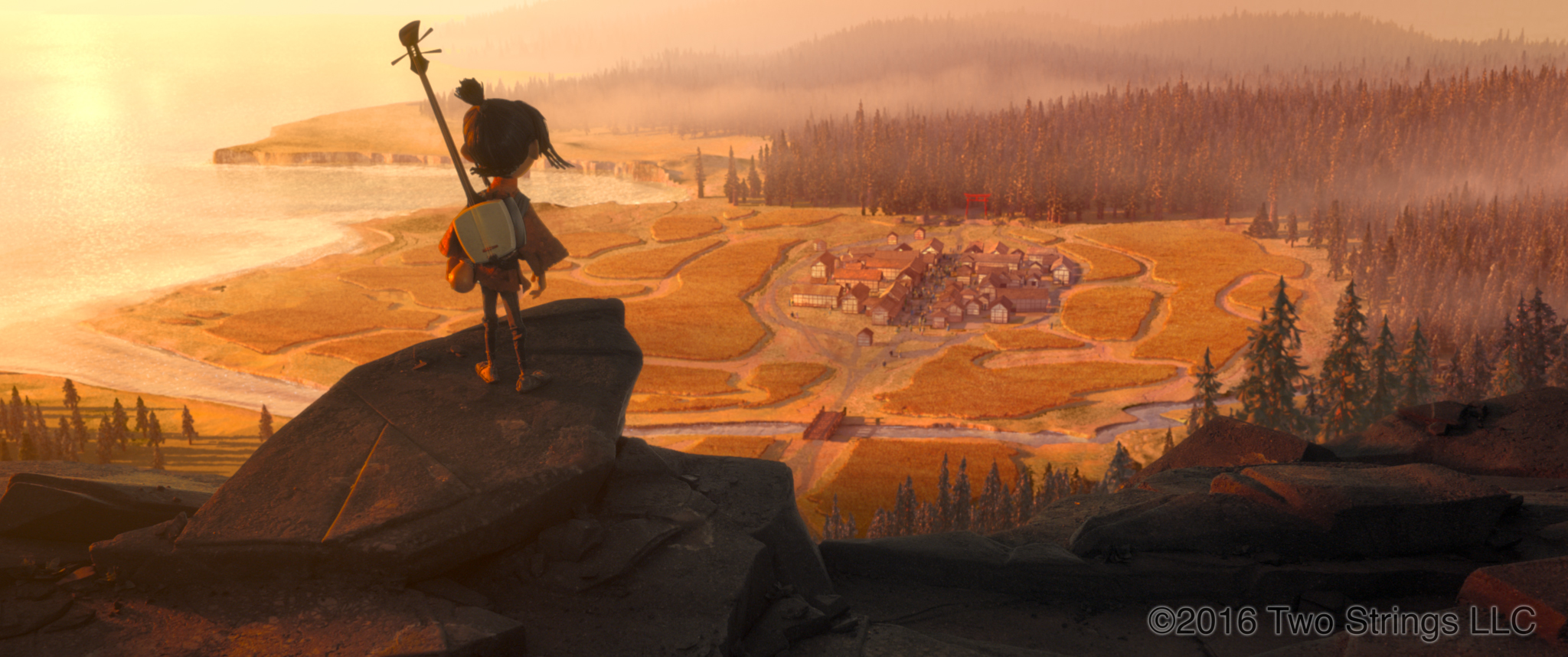
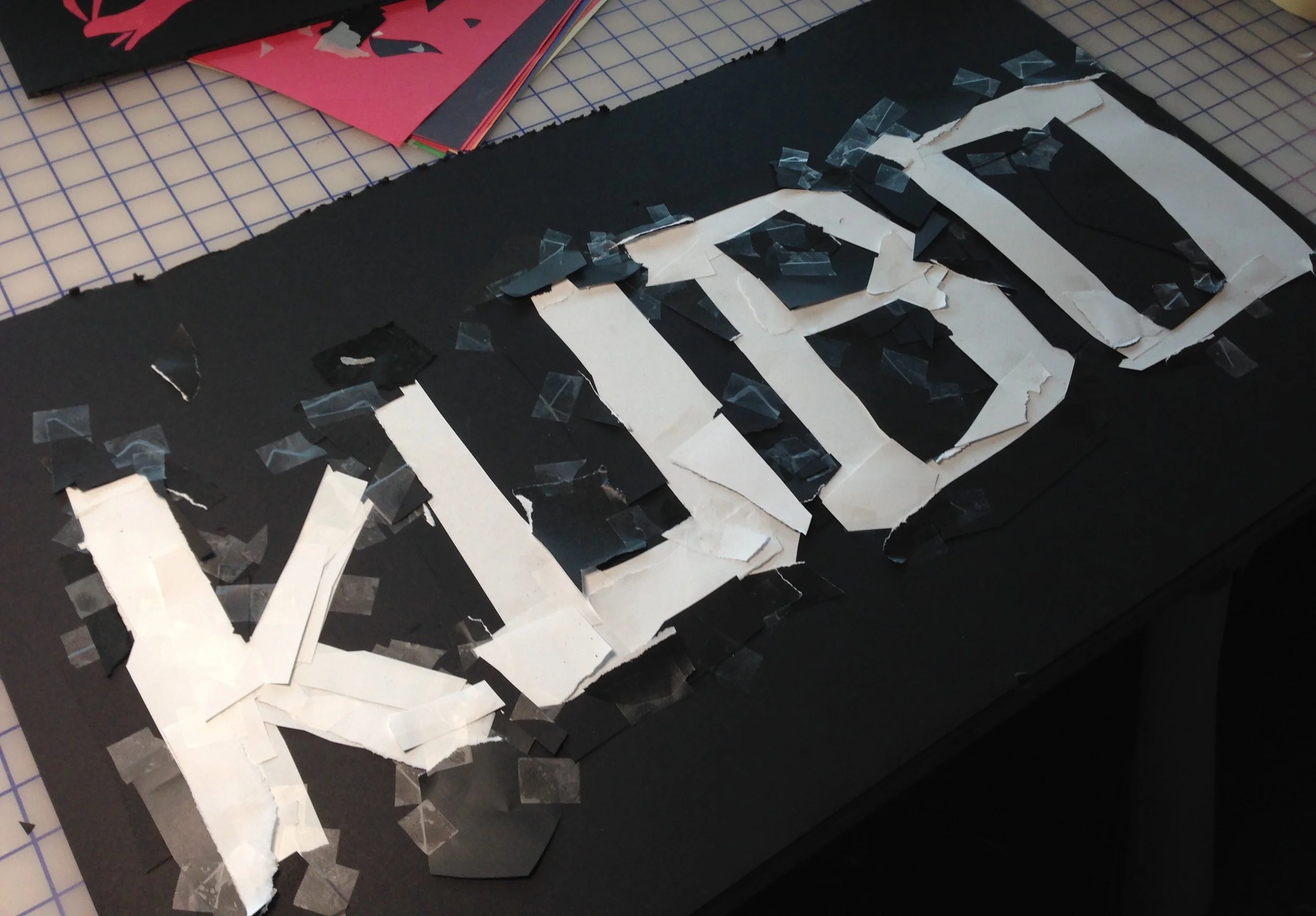
The first set that I focused on was the village where Kubo goes to put on his origami shows for the villagers. This set seemed like it might need some graphics for the various store fronts. There was one major issue: This film takes place in Japan, and I do not speak or write Japanese. I came up with a few generic words we might need for various shops, and Taro Goto assisted with translation. Using Kanji shapes as reference, I constructed each letterform out of cut and torn issue paper which I taped and glued onto black foam board. I scanned those paper pieces into the computer for final tweaking.
In addition to Kanji and the names of the shop fronts on the banners, I developed a collection of Mon symbols that could be used. I designed these in Photoshop, and then used the same paper construction to develop the symbols further. These were then laser cut into rubber stamps.

Early on I did some tests to see how we might get a pleasing final result for the banners in the village. I used our in house laser cutter to cut rubber stamps of my paper constructions, which I then inked on a stamp pad and stamped onto the cloth. I also tested stencils using rigid plastic and stencils using sticky vinyl. We took these tests out to a test unit that had a small section of a village building and approximate lighting, and determined the best results.
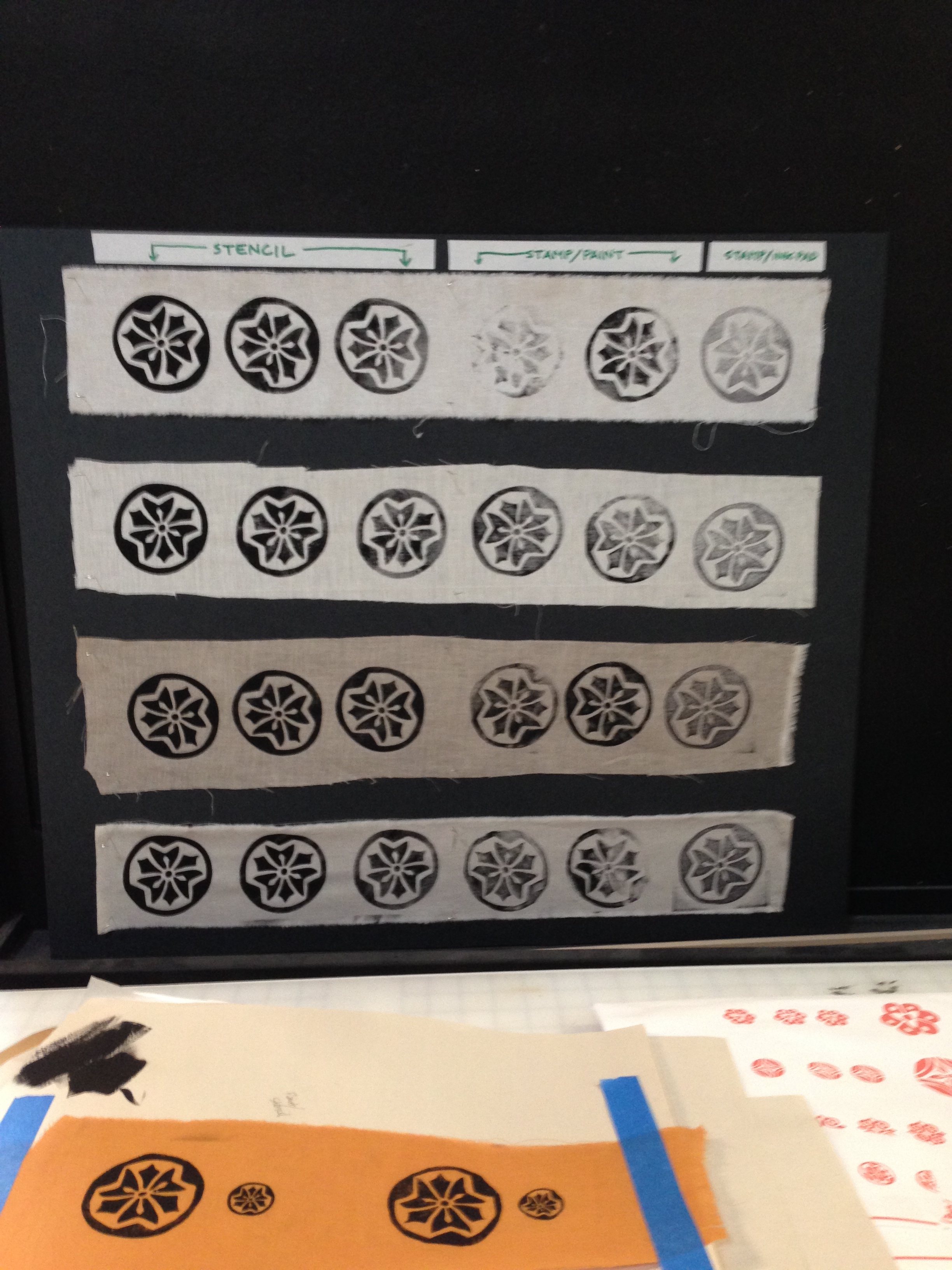
In the end we laser cut rubber stamps of my paper constructions that we then brushed with paint and stamped on to the cloth. The broken paint strokes gave the graphics a hand painted look, using a shape designed with cut paper.

Costumes

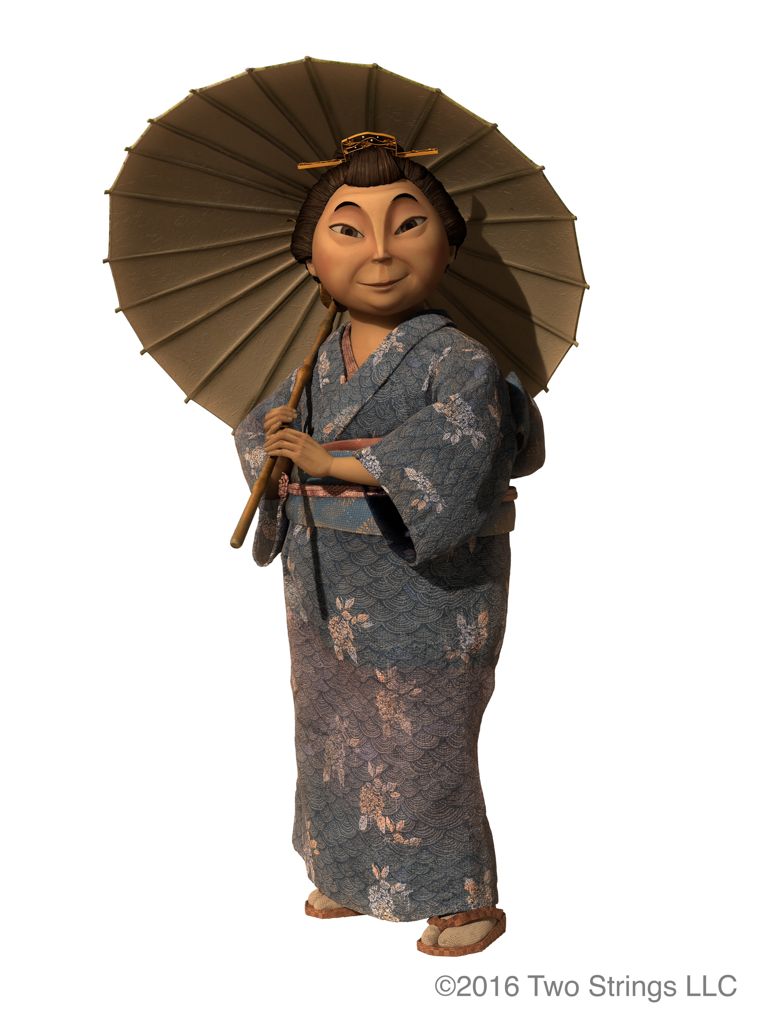
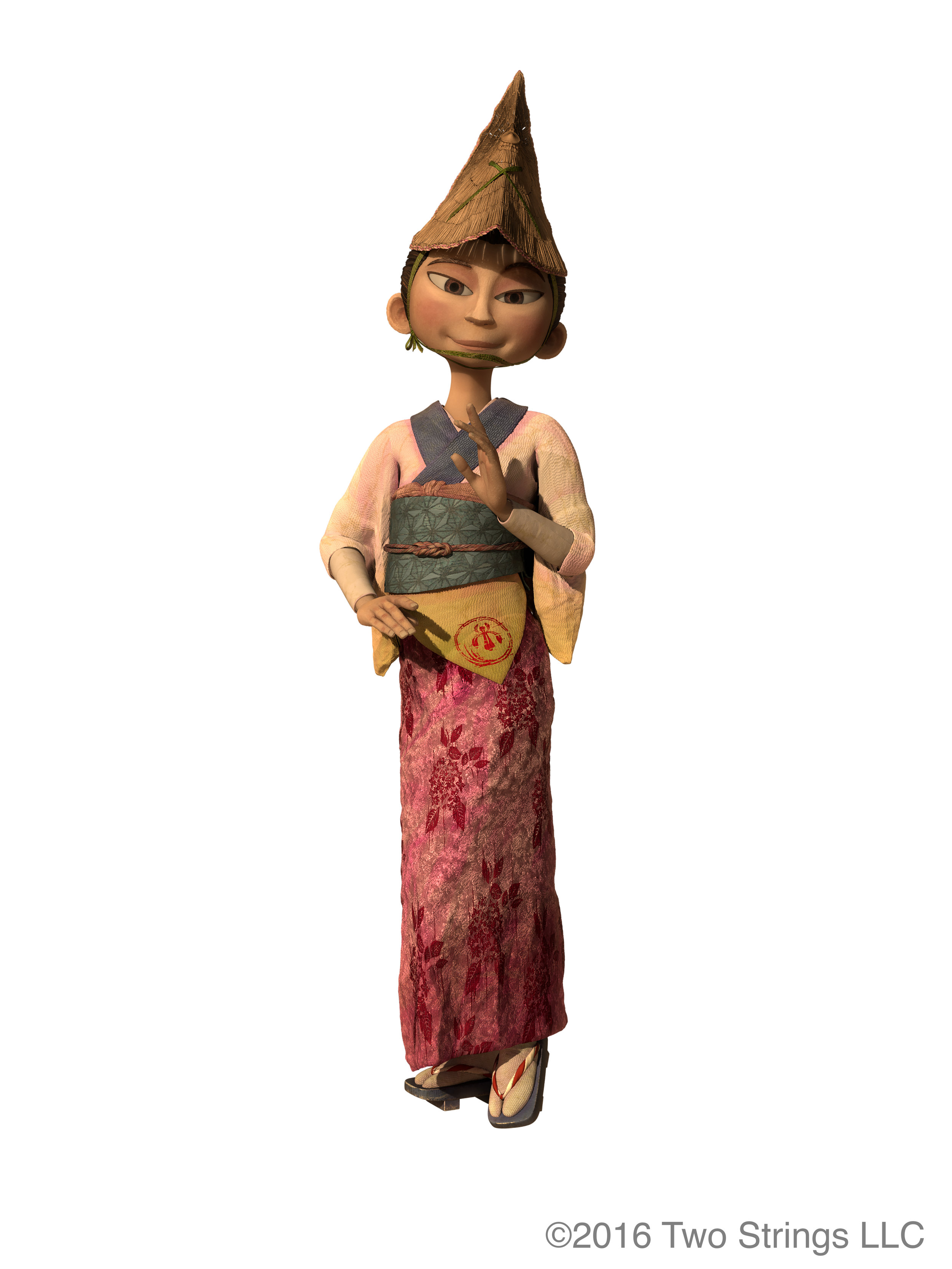
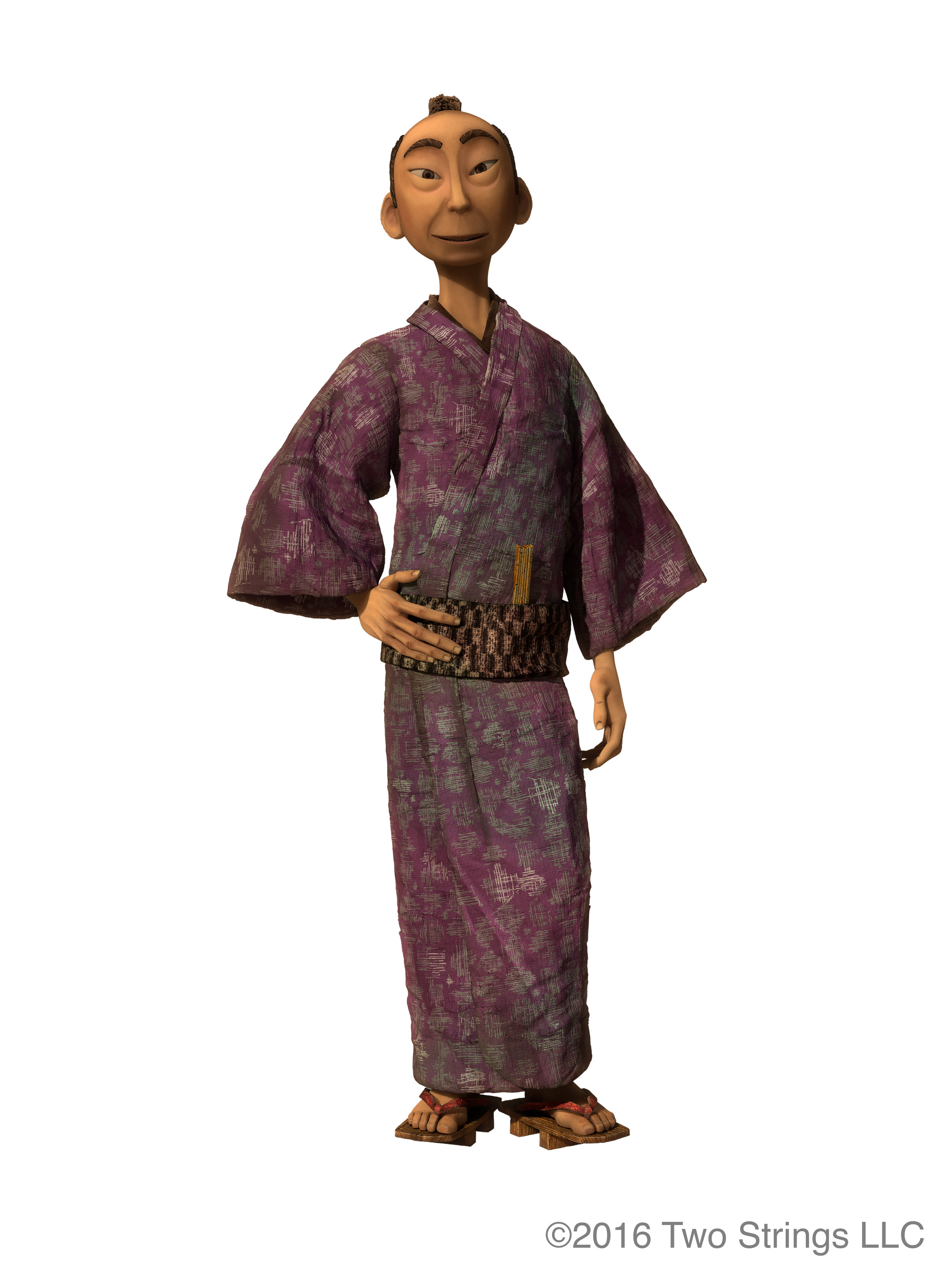
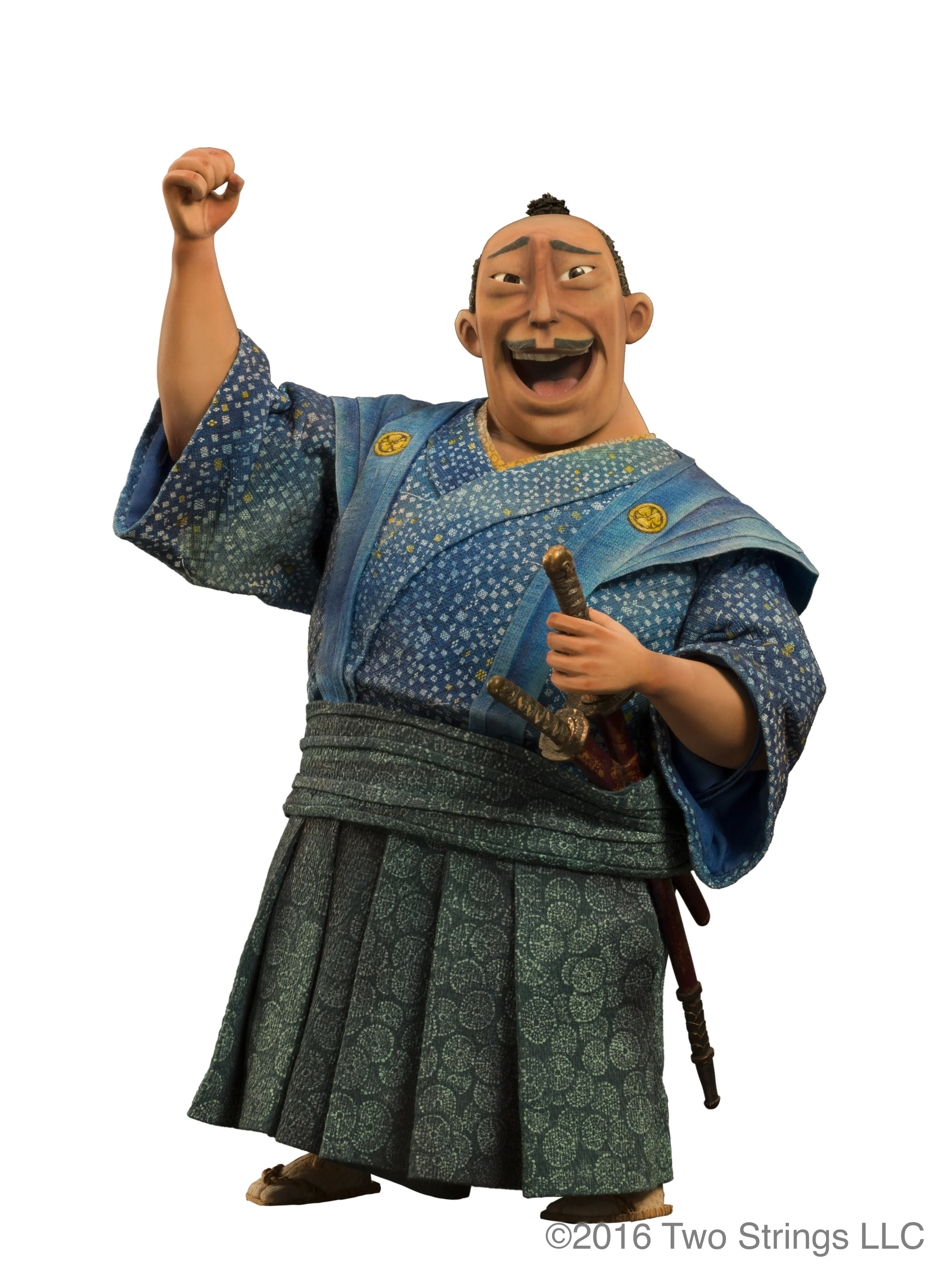
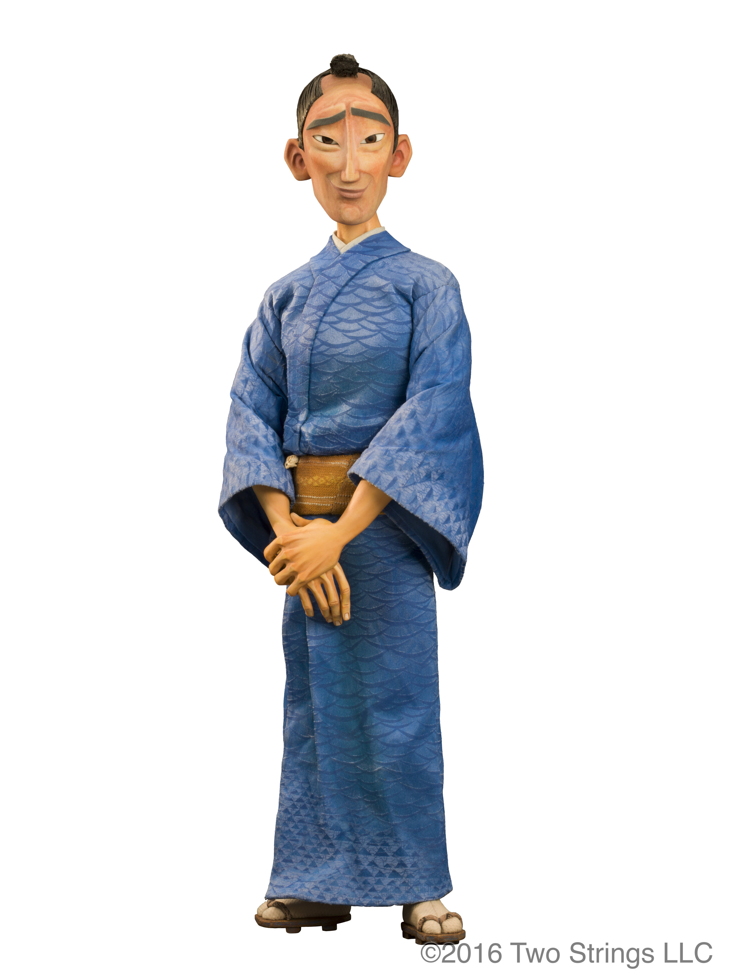
The village sequence was filled with background characters, and all of the characters would be wearing costumes covered in patterns. Deborah Cook was the costume designer on Kubo and is well known in the stop motion industry for her expertise in miniature costume design. I didn’t work very closely with Deb on the Boxtrolls as most of my character work on that film was the box labels which weren’t costumes in a traditional sense. On Kubo, I worked closely with Deb on the pattern designs for all of the characters. She would find reference of patterns and color palettes she liked for each character, and I would take that and go through the same process I was using on the environment graphics: design digitally, construct out of cut paper, scan and refine digitally.


In some cases the patterns were cut out of vinyl for use as stencils and sometimes we printed them directly onto the fabric. For the background CG characters, my pattern designs would be handed off to the cg department for use on the CG models.


Study

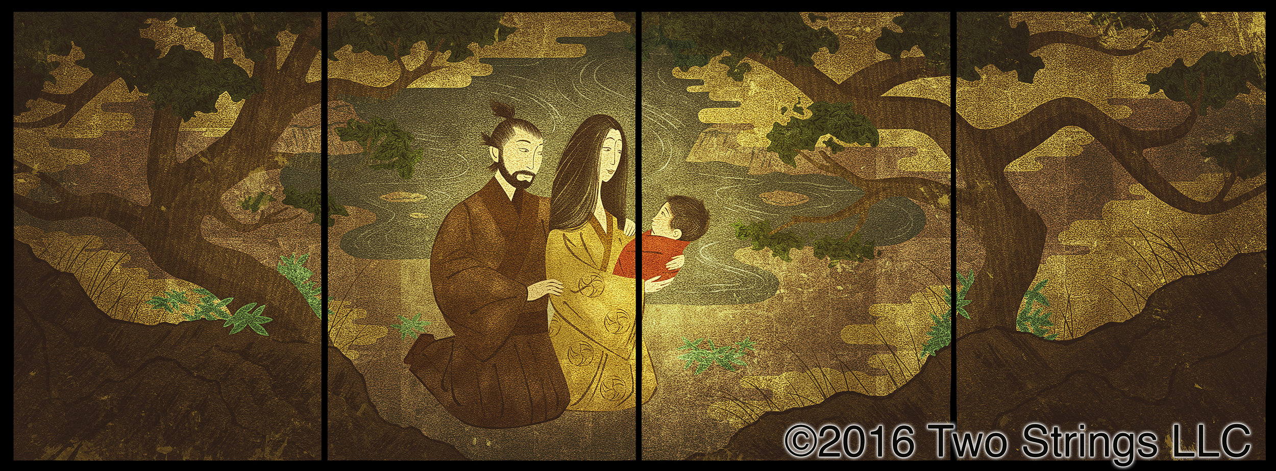
Hanzo’s Study was an environment filled with key storytelling graphics. In the early storyboards, the lead characters walk into the room and discover that each wall is covered in a mural depicting different elements from their journey. I was tasked with illustrating the final murals. I began by researching the artwork on traditional Japanese shoji screens, which often featured a sort of simplified use of perspective in what is known as the Floating World style. The challenge was to be sure these murals told the story they needed to with only a few seconds of screen time. In the mural featuring Hanzo and Sariatu holding baby Kubo, the director wanted the screen to split between the characters to represent the separation between Kubo and his parents. The challenge was positioning the characters in a way that felt natural while still hitting the story point. All of these were created digitally and then printed onto gold fabric to replicate the gold foil traditionally found on screens of this type.


Hanzo’s study also needed to be filled with various pieces of paper scrolls and books from some of the work Hanzo had been doing in the room. Some of the designs feature elements and characters seen elsewhere in the film. These are never seen in detail, so for the most part they are simple and vague with enough detail to look good from a distance.


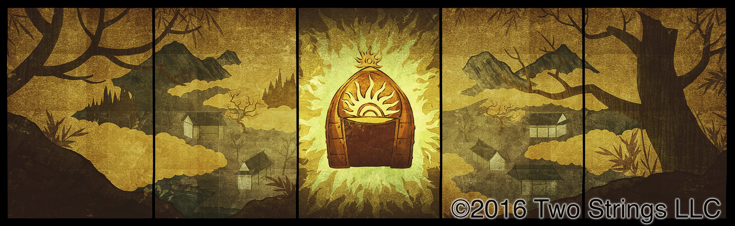
At the end of the study sequence, Kubo unravels a paper roll that tells him the location of the helmet, the final piece he needs to complete his quest. The artwork was created digitally and then printed onto paper.

Texture/Patterns
To achieve the look we were after for Kubo, every element in the film had some sort of texture. In some cases these textures were graphic shapes and were created in the art department and passed off to the painters and set artists to produce. In the Hall of Bones set I designed the jade tile and bone patterns that surrounded the room, and this artwork was handed off to the VFX department as reference for the cg modeling work they needed to do.


Concept Art
Concept artwork was created early in the development process by many amazing artists. Often times this artwork would provide a general direction for the overall tone of a sequence or moment in the film. At Laika, there is the challenge of having to construct all of the elements in the scene out of real materials, and for the look of the film to be somewhat illustrative. Because of that process, sometimes another piece of artwork needs to be created that acts as a guide for the paint, model making, set construction or vfx departments to create specific elements. I was asked to work on a few illustrations that could be passed on to these departments to give them a target to aim for in their work.


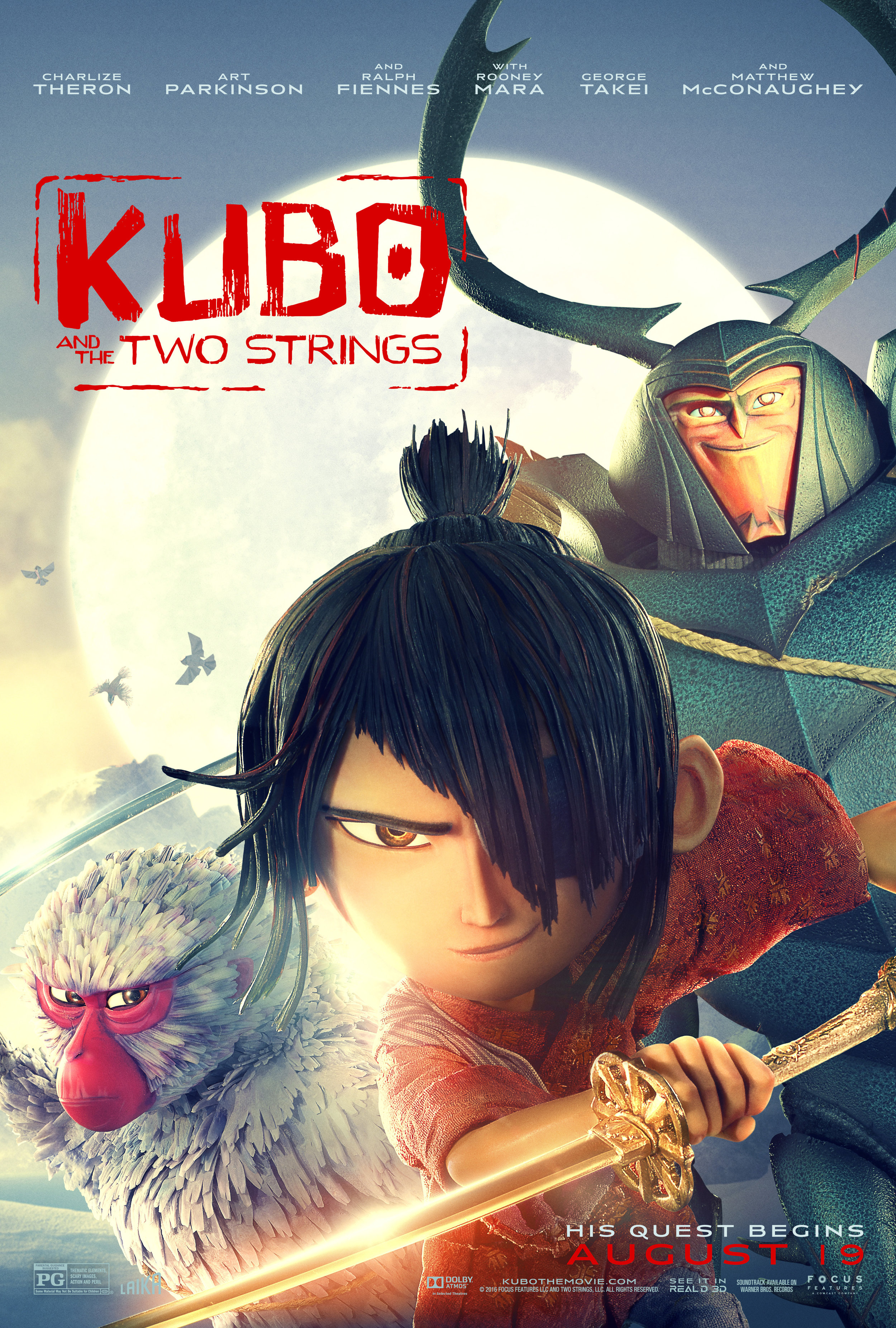
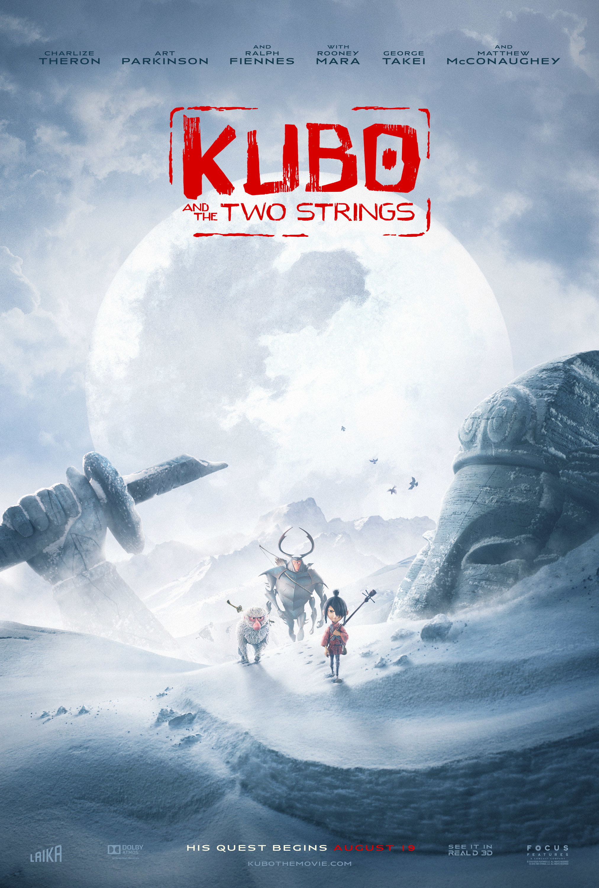
Logo

At some point in the middle of production a logo needed to be created for internal use and potentially marketing use as well. Shannon had already begun exploring logo options during the development phase, so I had a starting point. Shannon was clear in his direction early on that he didn’t want anything that looked like a cheesy, westernized version of kanji in English. I played around with different ideas, a few with brush lettering that I thought seemed promising.
Ultimately we went in the direction of a block lettering style that shared some of the shape language from the characters and environments, and looked crude in a way that seemed childlike without being too childish. I used the same paper construction technique, scanned that in, laser cut a rubber stamp, stamped that onto paper, and scanned the stamped image to render the final logo.
It wasn’t certain whether or not this would be the final logo, but I suppose it ended up doing the job well enough that it stuck.
In total I worked for a little over a year and a half on Kubo and the Two Strings. Not knowing exactly what my role would be in the beginning and then having the time to find a graphic style as well as expand my contributions to the art department all added up to a very gratifying experience. It has been amazing to see the audience at large connect with Kubo and appreciate the amount of care and work that went into making the film.
-Josh
