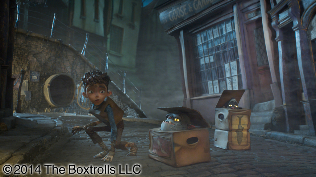
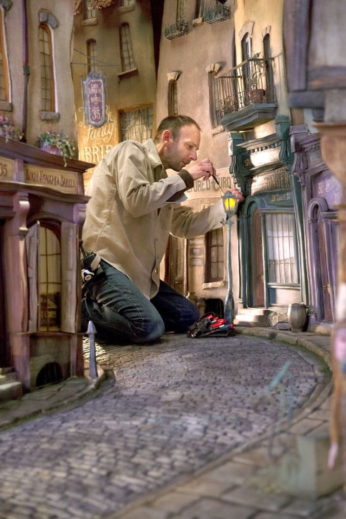
In August 2012, Monica and I moved up to Portland where I joined Laika on their most recent film, The Boxtrolls, as their Graphic Designer. What exactly does a Graphic Designer do on a film? Designs graphics of course! What are graphics, you ask? Great question. Come along as I walk down memory lane and point out a few of the highlights.
Boxtroll Labels
Designing all of the Boxtroll labels was by far the most exciting and most time intensive element of the Boxtrolls from a graphic standpoint. The time period for our film was the end of the 19th century, a time rich in graphic delights. When I first joined the project the art directors had already pulled a lot of reference from the time period which provided a great jumping off point.
We began with the “hero” characters’ labels. These were any characters that would be featured actors in the film. Annie Atkins started a few of these designs prior to me joining the project. My first task after joining the team was to finish the design for Fish’s label. Next I tackled Shoe and so on through the hero characters.
After completing the hero Boxtroll labels, I moved on to designing all of the labels for the background Boxtrolls. This was fun because I, along with the graphic assistant KC Englander, sat down and came up with a list of potential Boxtroll names. In the beginning we didn’t know how many Boxtrolls there were going to be, we just knew there would be a lot. And there were! Below is a good sample of most, but not all of, the Boxtroll labels I designed for the project.
The boxes for the background Boxtrolls were in 3 unique box sizes: A,B, and C. This simplified the puppet department’s job of making all the boxes and still allowed for a visual variety. The challenge for me was keeping the designs all unique but unified so that they looked like they belonged in the Boxtroll world.
First I roughed the lettering in to get an idea of the style, and blocked in the color. Then, to transform the lettering into the Boxtroll style, I redrew all of the letters with our wobbly line which is carried throughout every element in the film. The illustrations on the labels were drawn using the same technique. It took us a few months of exploration early on to dial in the specific look of how the lettering and illustrations worked together. One of the things I love most about my job is the ability to get to design and illustrate every day.
Boxtroll Cavern
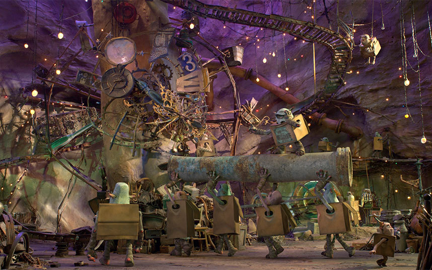
The Boxtrolls live underground in what we referred to as the Boxtroll cavern. Our main character, Eggs, lives in one small nook of the cavern. I was tasked with creating all of the things Eggs would have hung up around his “room.” The concept was that these were all things Eggs would have collected when he went up into the human world on his nightly excursions. The images he has collected are all about the aboveground world, and prominently feature the sky and stars. I also included drawings Eggs would have made of his buddies Fish and Shoe (drawn with my left hand). There’s also a piece of music on the wall that is hung sideways because Eggs doesn’t know what written music is, or which way it should hang.
In the center of the cavern was a giant clock assembled by the Boxtrolls out of bits of scrap. This is a good example of the kind of collaboration that happens on almost every element that goes into making a movie at Laika. Joe Kortum, a prop designer on the Boxtrolls, designed the clock prop while I handled the graphic elements. In this case I designed the number pieces to look like they came from a bunch of different places in the above ground world. There is also a chalkboard on the left side of the clock that illustrates how nighttime is the time for going up and grabbing rubbish, while daytime is the time when Boxtrolls get snatched.
Around the cavern walls I developed a style for what we referred to as the Boxtrolls “hieroglyphics.” The walls were covered in scratchy little drawings that were reminiscent of children’s drawings and of mechanical things the Boxtrolls were interested in.
Cheese Guild
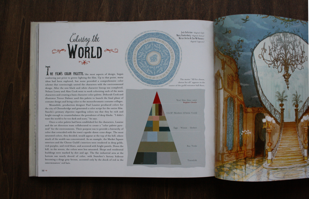
The main building at the top of the town of Cheesebridge is the Cheese Guild, home of our character Winnie. The entrance hall, seen below, was the most we see of the interior of the guild. I designed the fabric wall panels, as well as the center piece on the floor. The latin translates to “Cheese for all-All for Cheese.”
The Curdatorium is a room inside of the Cheese guild where the guild members meet and discuss important matters (cheese). This set was particularly fun for me to work on because it was filled with graphics. Lots of paintings on the walls and patterned fabric.
Market Square
Market Square is one of the largest sets we built for the Boxtrolls. It was also one of the first sets built, as shooting took place on it for almost the entire production. As it was the main town square, it was very graphics heavy. Below is a shot of Eggs’ first venture out into the Square. I designed the manhole cover (with a nod to Here Be Monsters, the film’s original title), all of the signage around the square, as well as the photo op with the scary Boxtrolls. This was meant to be the human representation of how they imagined the Boxtrolls to look.
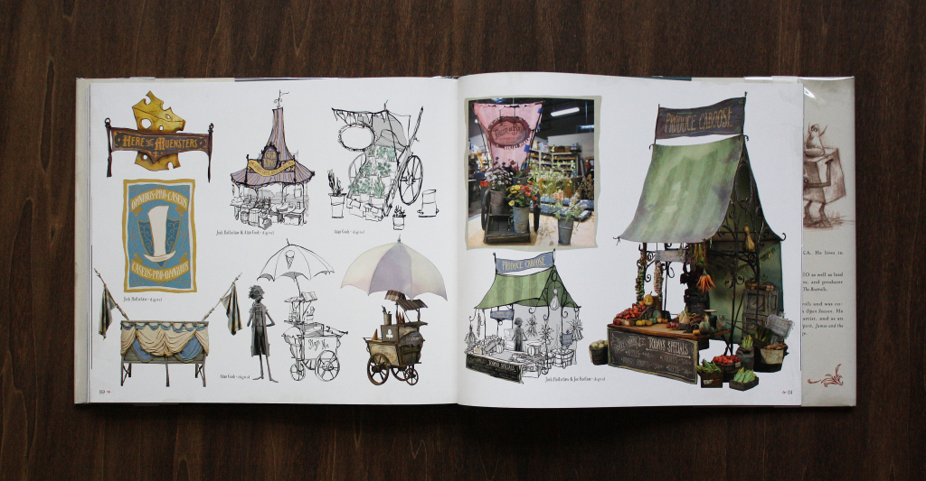
Around the square there were a few carts that needed graphics. The carts themselves were designed by Alan Cook and built by the model shop at Laika. Once the prop was built I photographed it and created my designs on top of the photos so that all of the graphic elements would fit the prop. KC and I then cut vinyl stencils that were handed off to the paint department and they painted the graphics on to the prop.
Also found in Market Square is Madame Frou Frou’s traveling stage cart. I designed the large banner that attached to the front of the cart, which was really fun to do. My goal with the lettering was to make it so fancy it was almost grotesque, lots of ugly ornamentation. An echo of Frou Frou herself.
Snatcher’s Truck
The graphic on the side of Snatcher’s vehicle was a fun one to do, mostly because designing anything for the “bad guys” offered a chance to break the rules a little bit. The graphics needed to reflect the nastiness of the characters they were supposedly created by. I approached this design by thinking about these buffoons trying to paint the side of this truck the best they could. Its a little rough around the edges, much like the characters themselves. This graphic also shows up on the exterior of Snatcher’s factory later on in the movie.
I also designed a lot of signage that was dressed on to the buildings on the different street sets. Here is a shot with Snatcher’s truck, a couple of murals on walls, posters, and signage. Once the set shop started construction on the buildings, I would photograph the facade and plan out where the graphics might fall along the street. Part of this process was figuring out what type of businesses might go into each building, and then KC and I would generate a list of possible business names.
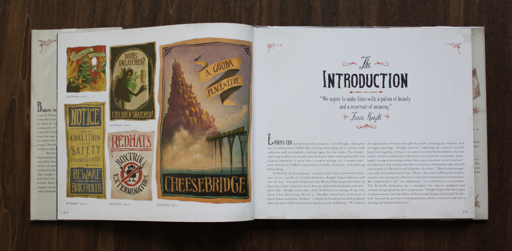
This spread from the Art of the Boxtrolls book shows in greater detail more of the types of signage I developed along with KC to fill out the street sets. Lots of puns and names of crew members and friends.
This post only begins to scratch the surface of everything we designed for the film. All in all I worked for about a year and half on the Boxtrolls. Developing the graphic look for such a rich world really was a dream project. Getting to work in miniature, designing these tiny graphics and then seeing them in the final set is such a gratifying experience. The shots look beautiful on screen, but the sets are even more amazing to behold in person. Thanks for reading and if you have any questions feel free to ask away in the comments.
-Josh


